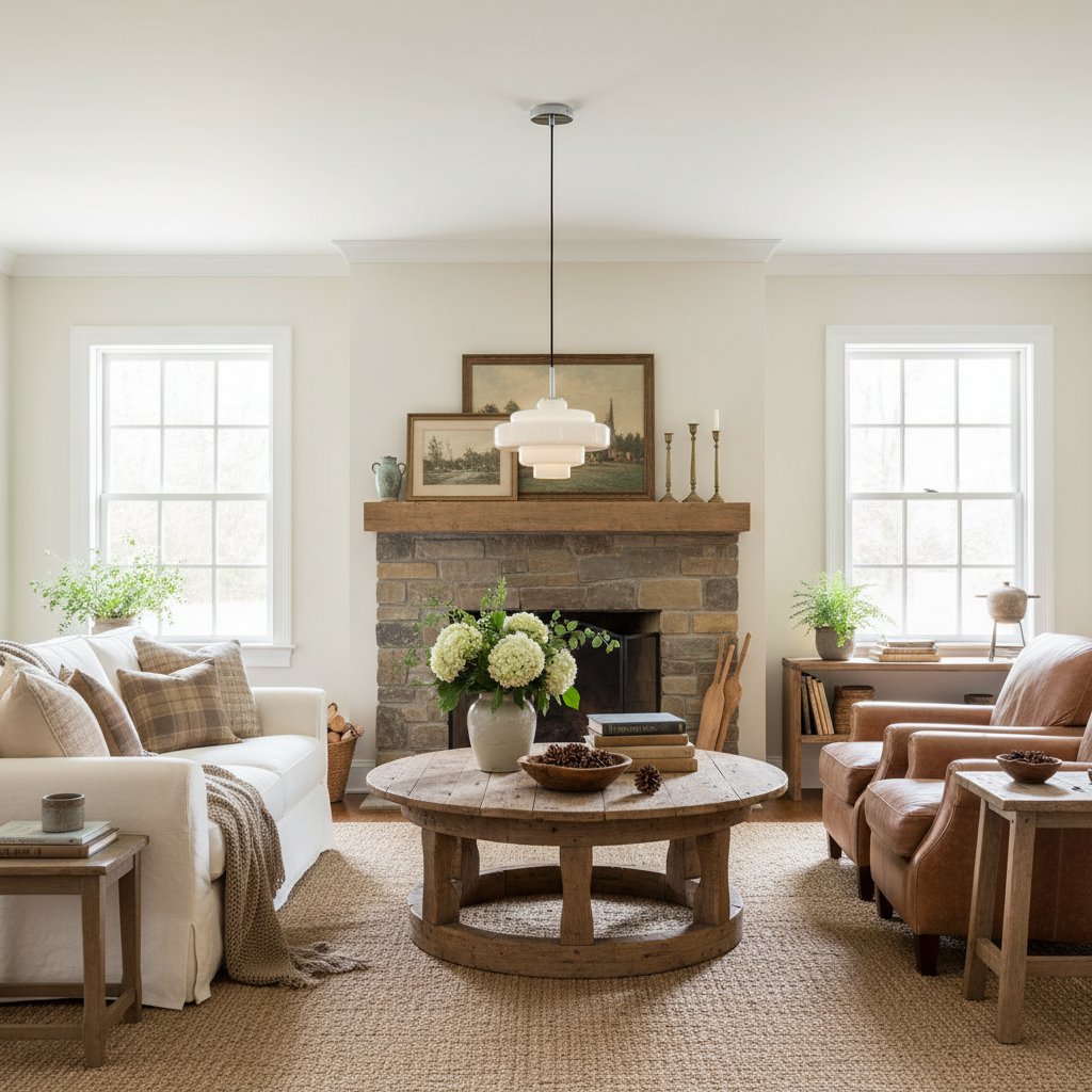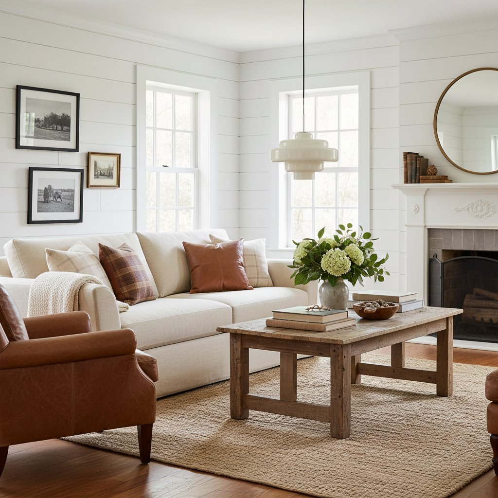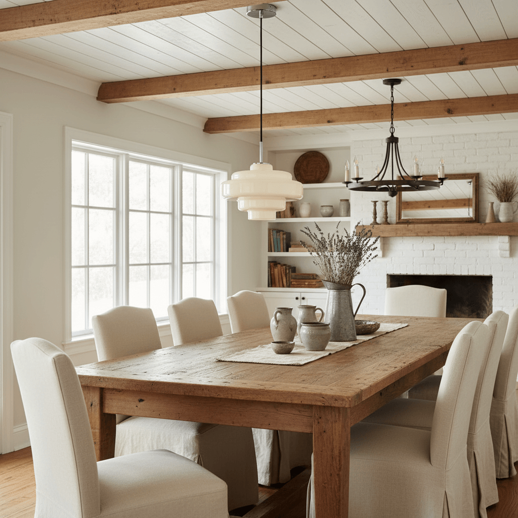
How to Match Glass Pendant Lights with Furniture and Finishes, Step by Step
A glass pendant light should relate to the room without looking as though it came as part of a matching furniture set. The most reliable approach is to connect it to two or three permanent features - such as timber tone, worktop colour and metal hardware - then let smaller accessories remain flexible. This guide takes you from reading the room's undertones to checking scale, installation and the final balance.
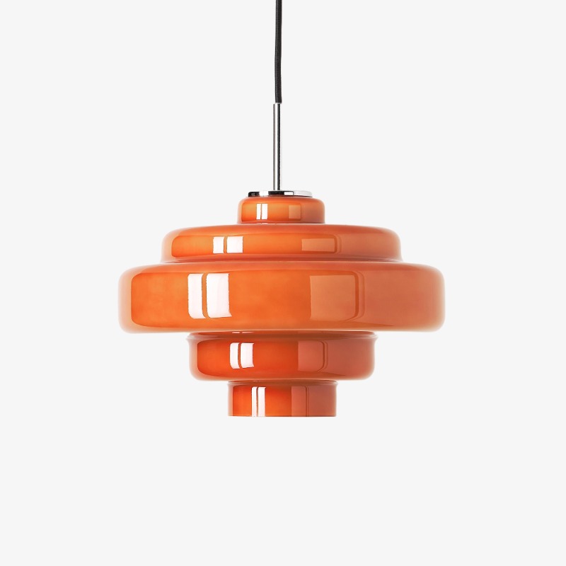
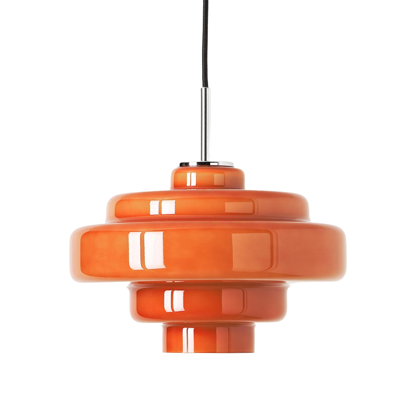
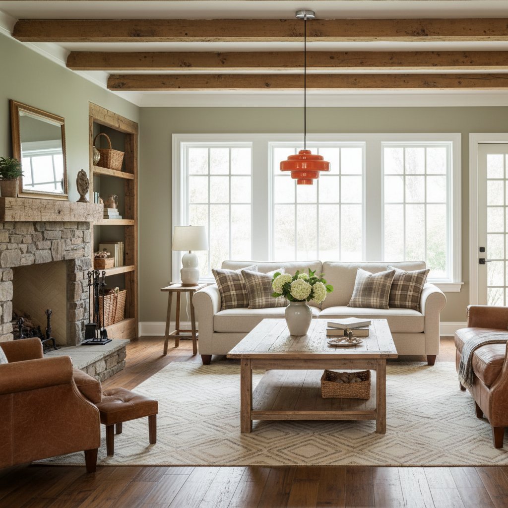
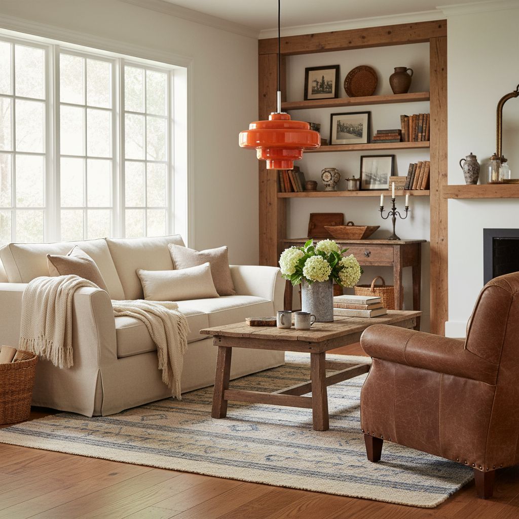
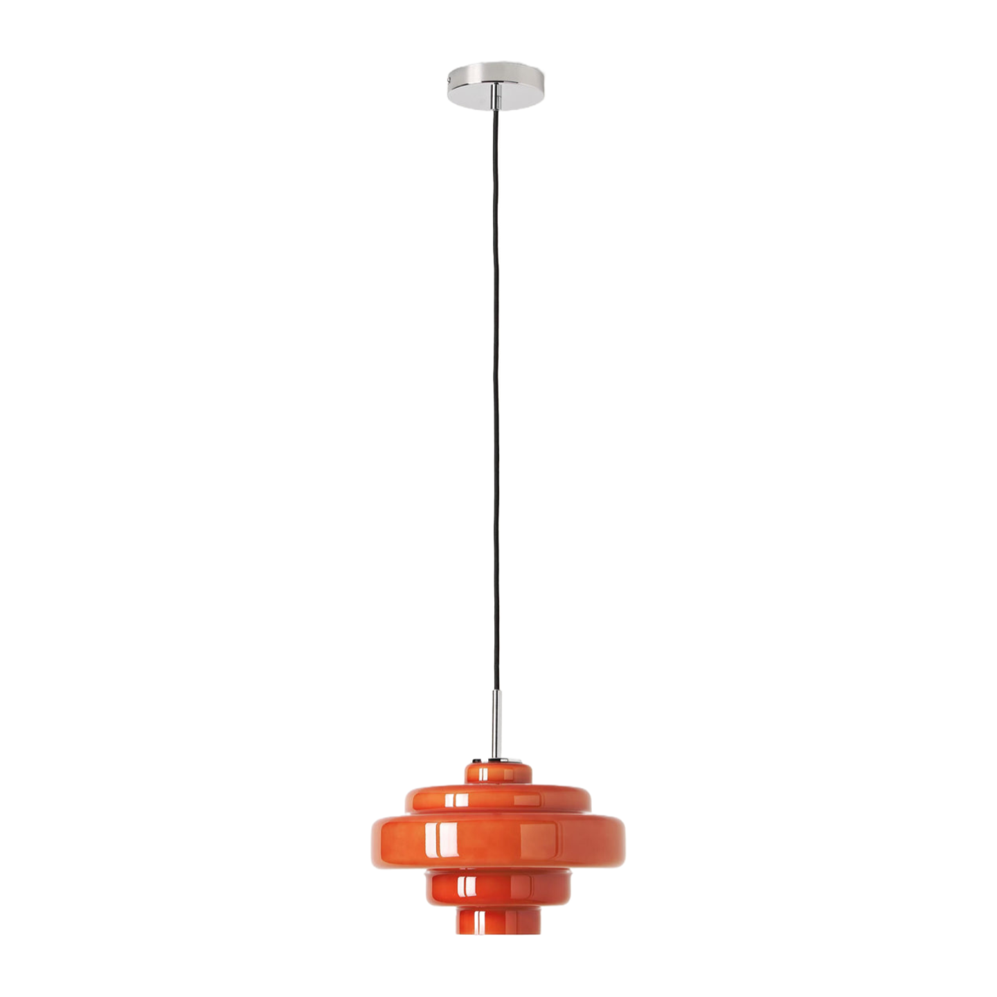
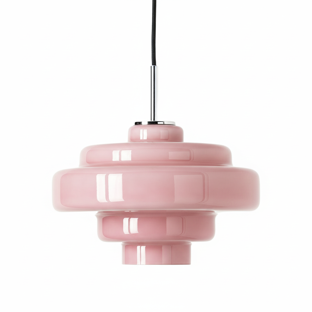
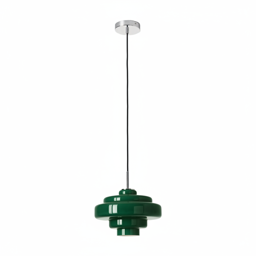
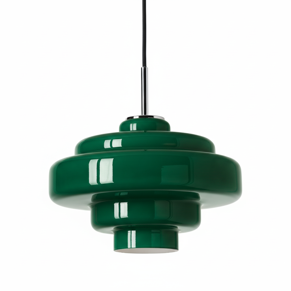
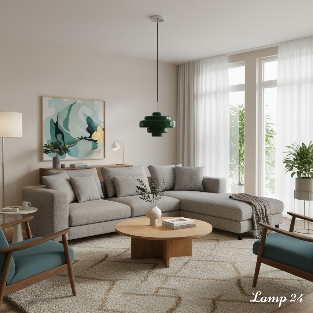
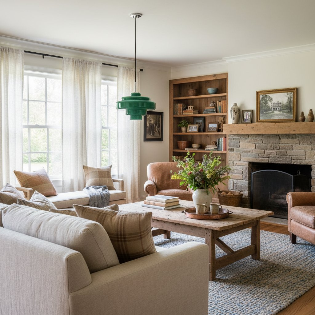
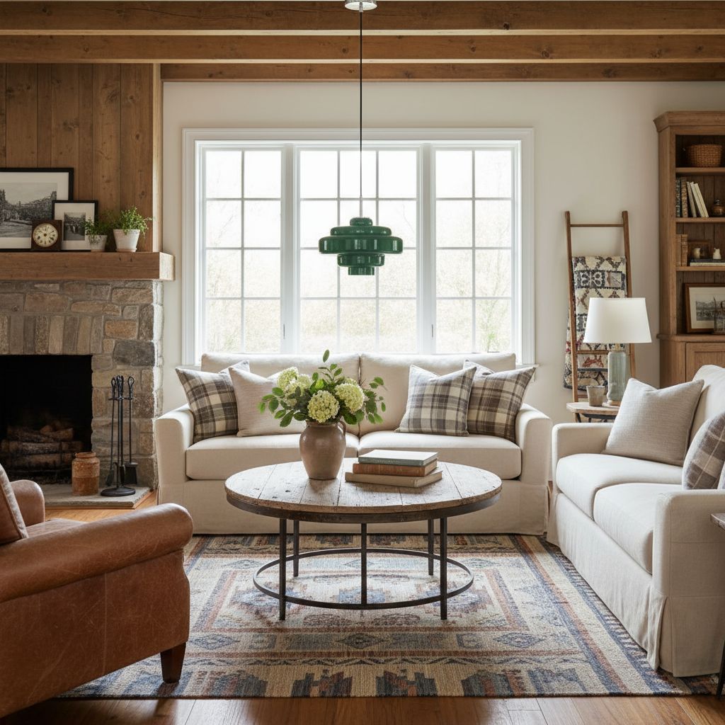
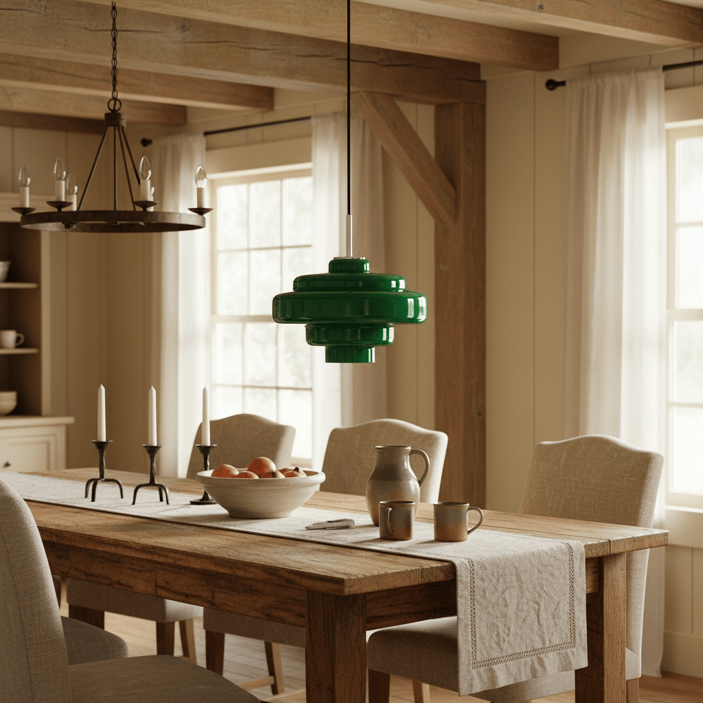
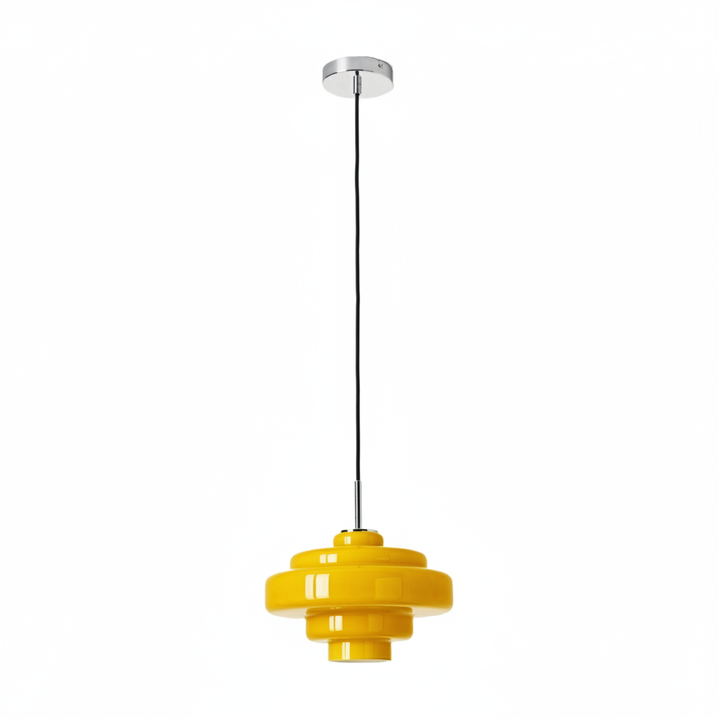
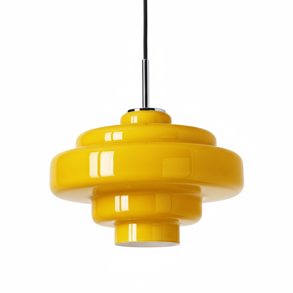
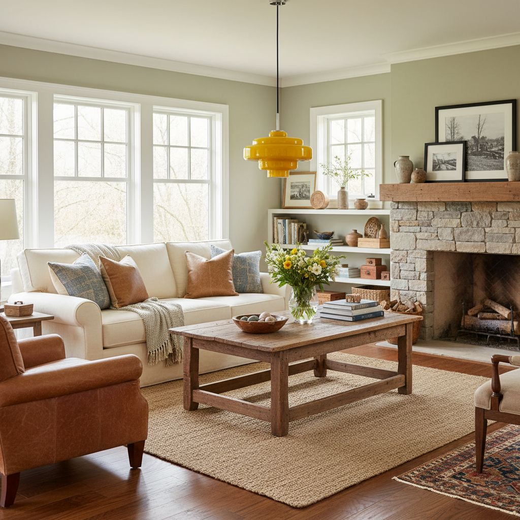
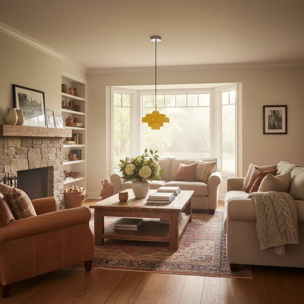
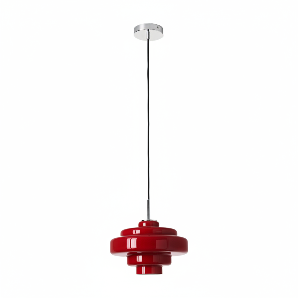
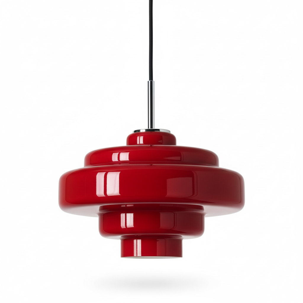
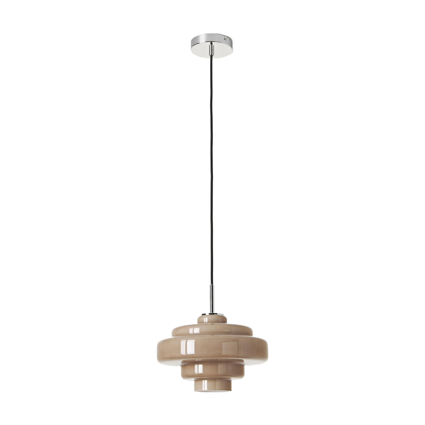
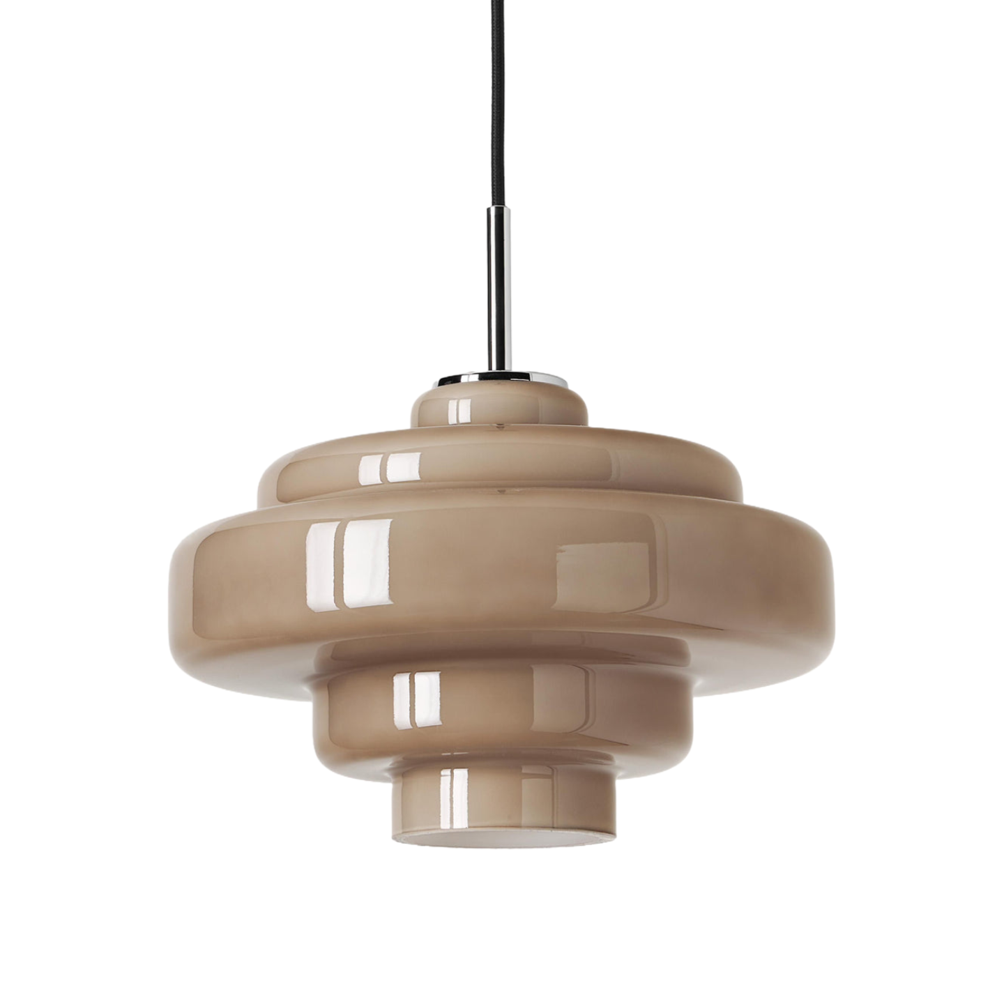
The goal is not perfect colour matching. It is visual agreement. A warm amber shade can complement walnut without copying it; green glass can echo natural materials without matching every plant; smoke glass can support chrome and stone while keeping the room calm. The Koloro Retro-Inspired Colored Glass Pendant is useful for this process because its coloured glass, rounded form and chrome details provide several clear points of connection.
Before You Choose: Make a Five-Minute Room Inventory
Stand where the pendant will be most visible and list the features that are difficult to change:
- dominant timber tone in floors, cabinets or the main table;
- worktop, tile or wall colour;
- metal finish on handles, taps and furniture legs;
- shape of the table and largest furniture;
- daylight level and evening bulb colour;
- ceiling height, power point and intended hanging position.
Rank these features instead of treating them equally. A large oak table matters more than a tiny brass tray. White walls are usually a background, while a coloured worktop may act as a strong design direction. This ranking prevents the common mistake of choosing a pendant to match one small accessory that may move next month.
Step 1: Find the Room's Temperature Before Its Style Label
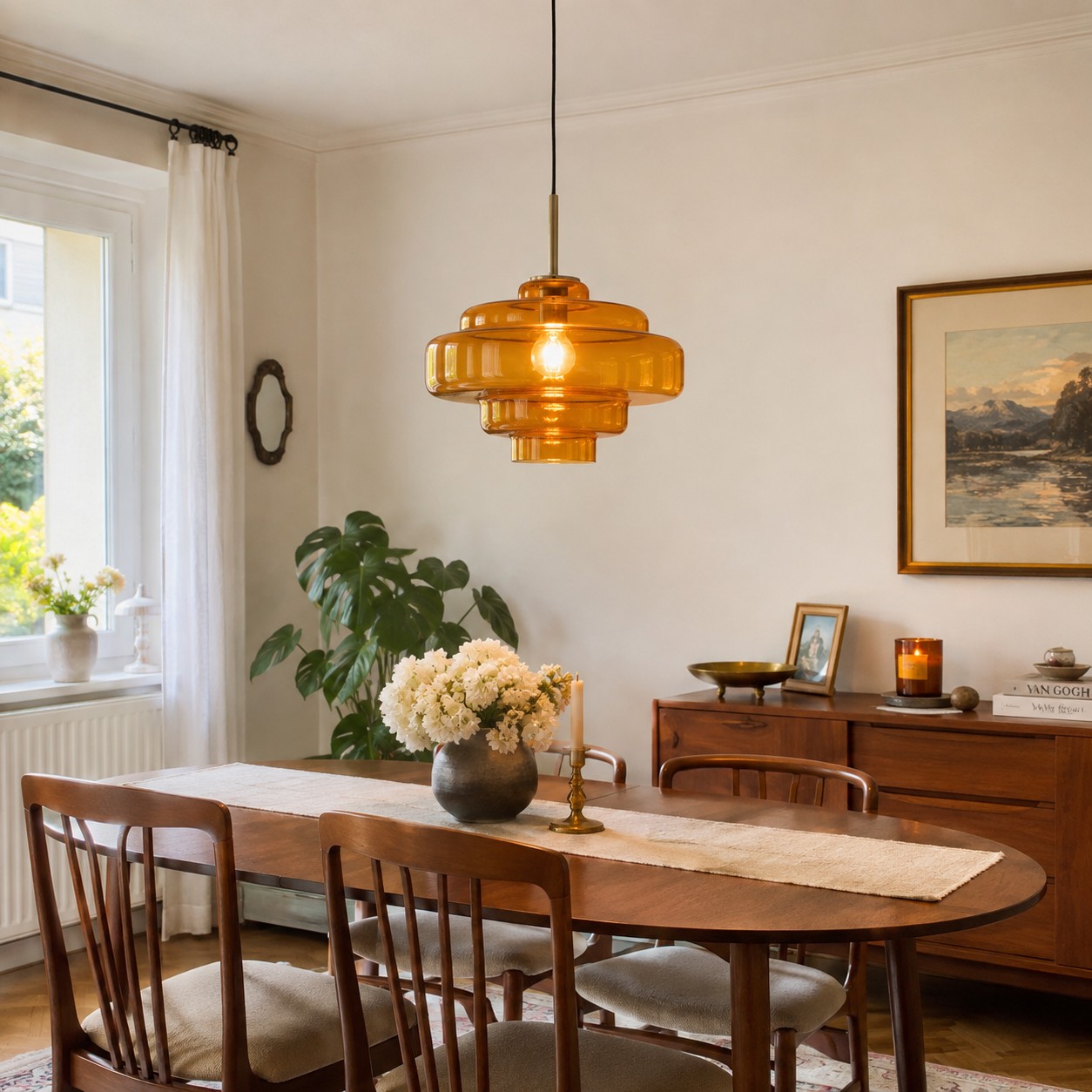
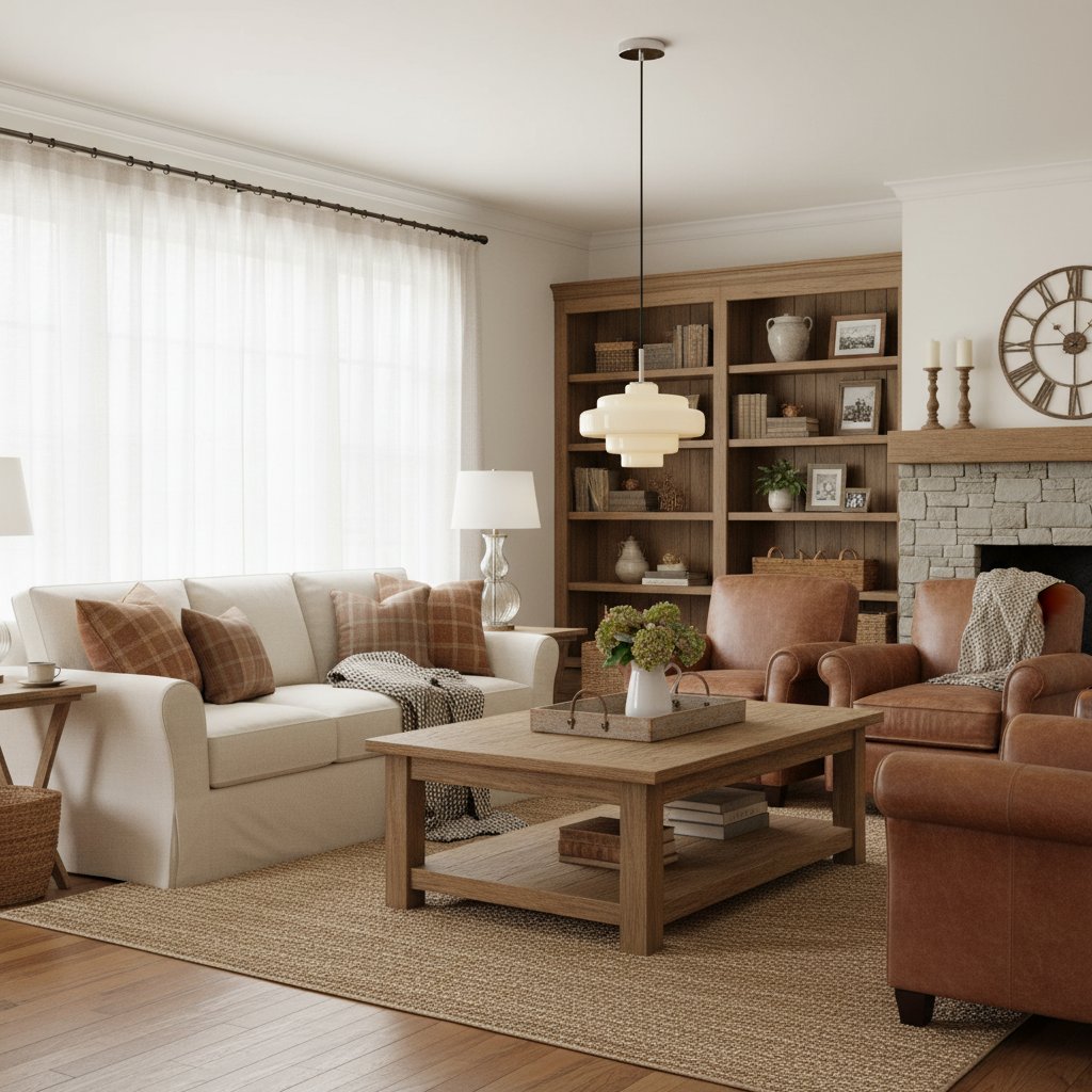
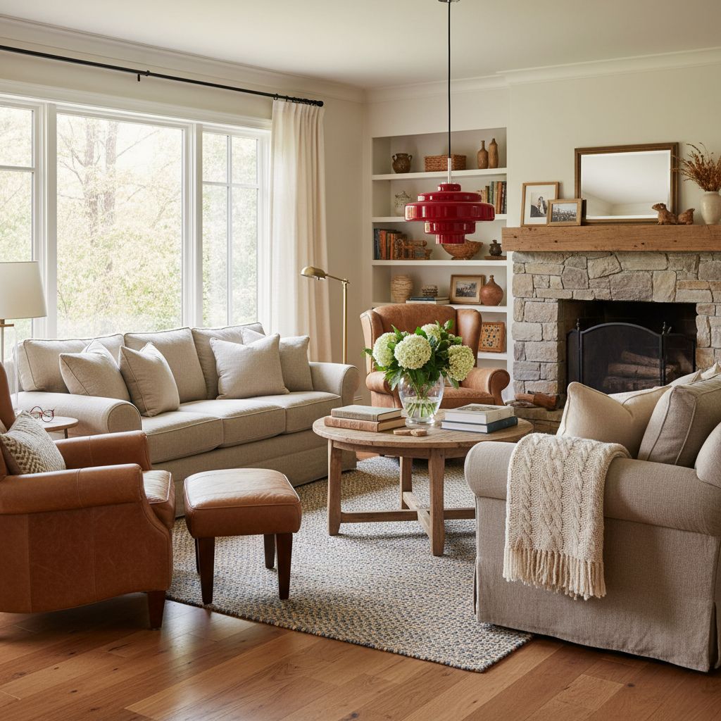
Begin with warm versus cool, not with labels such as modern, retro or Scandinavian. Warm rooms often contain honey oak, walnut, cream, terracotta, aged brass or warm white paint. Cooler rooms lean towards grey stone, bright white, chrome, blue-green tones or black metal. Many successful rooms mix both, but one temperature usually dominates.
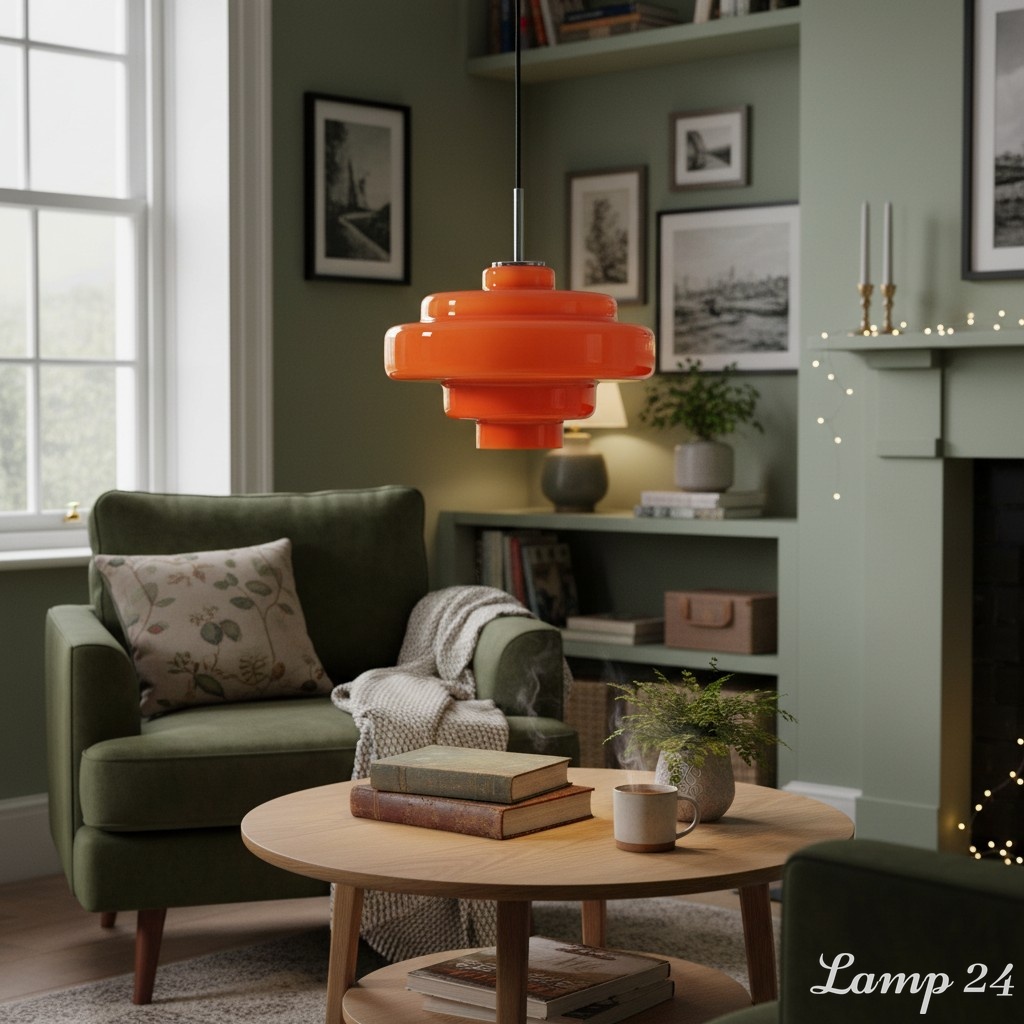
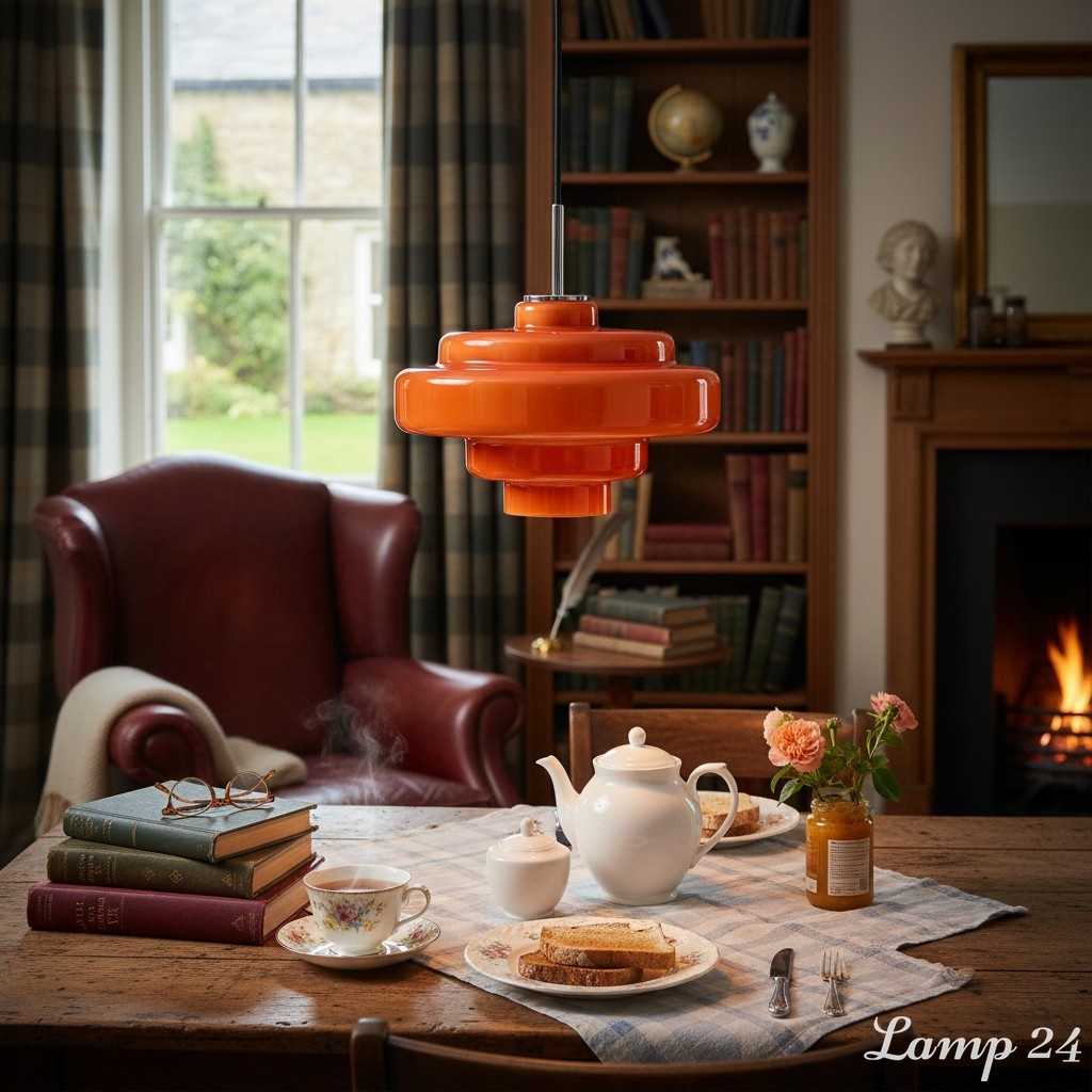
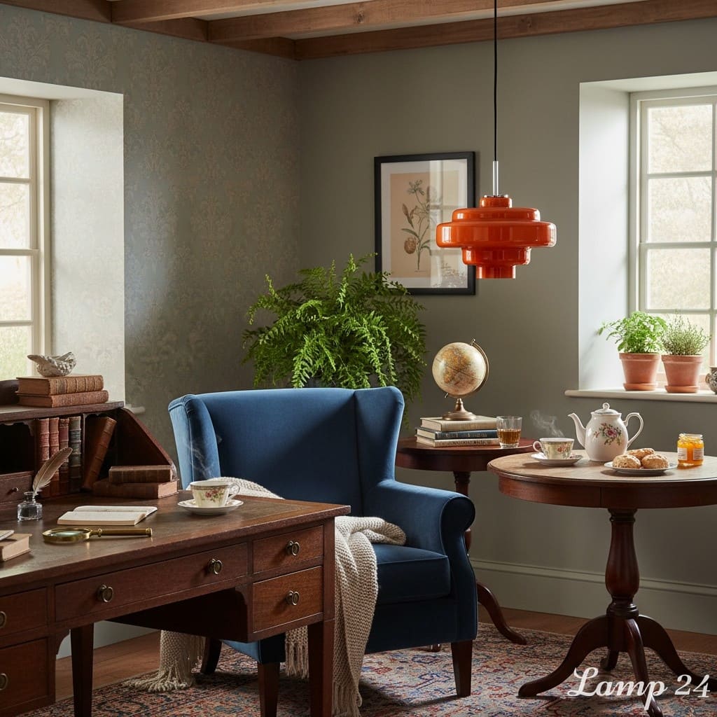
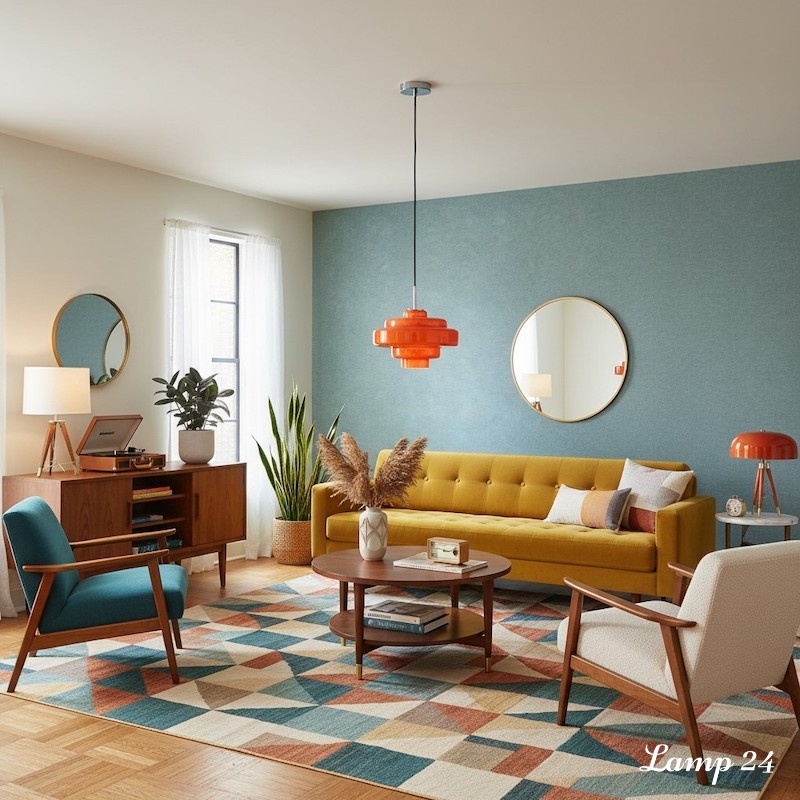
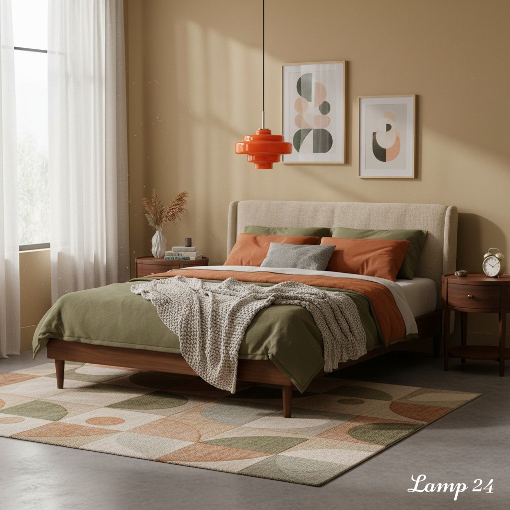
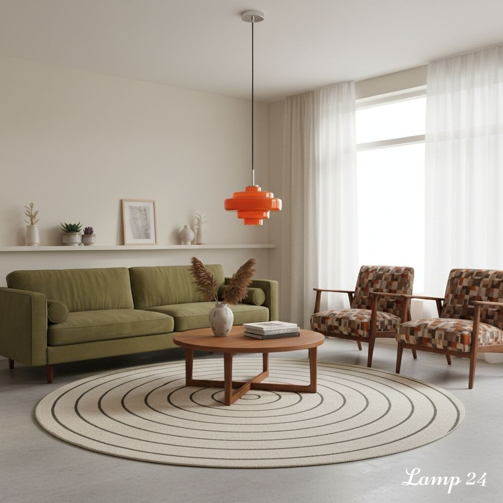
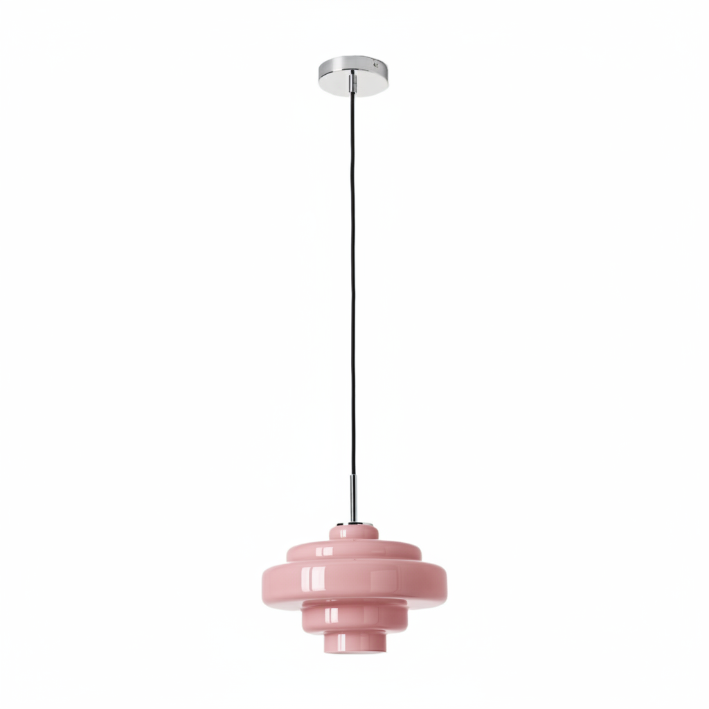
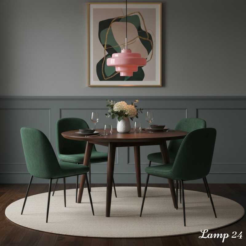
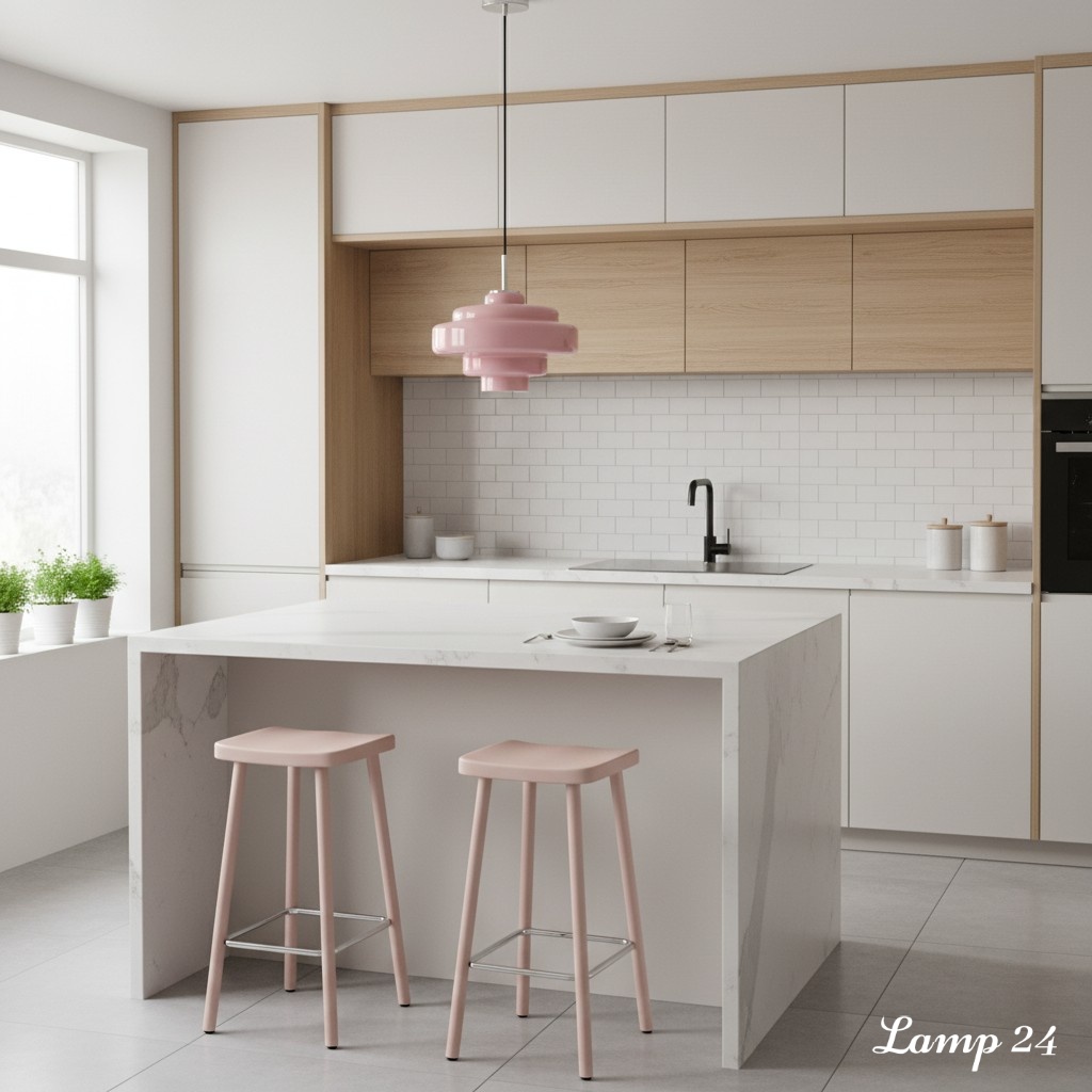
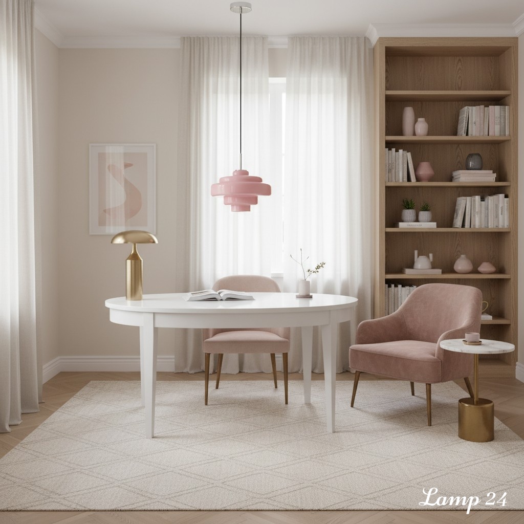
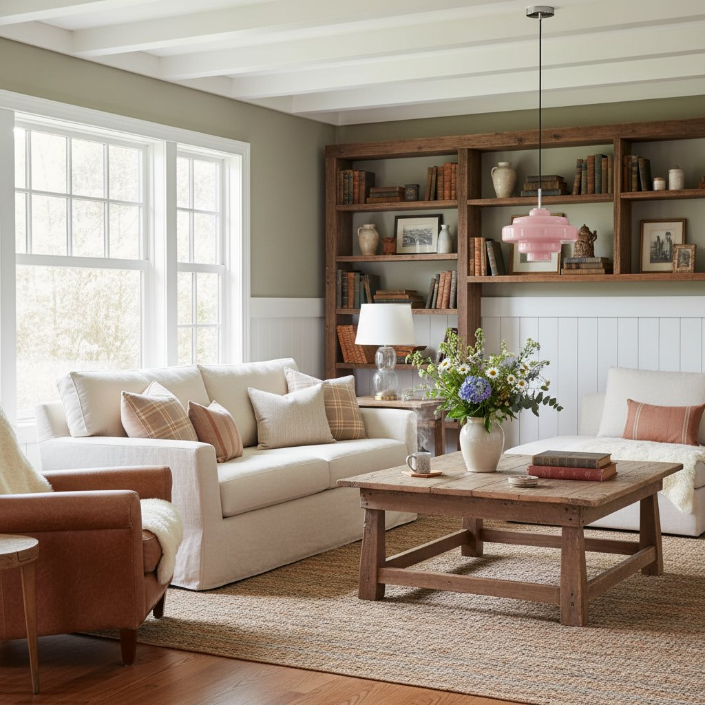
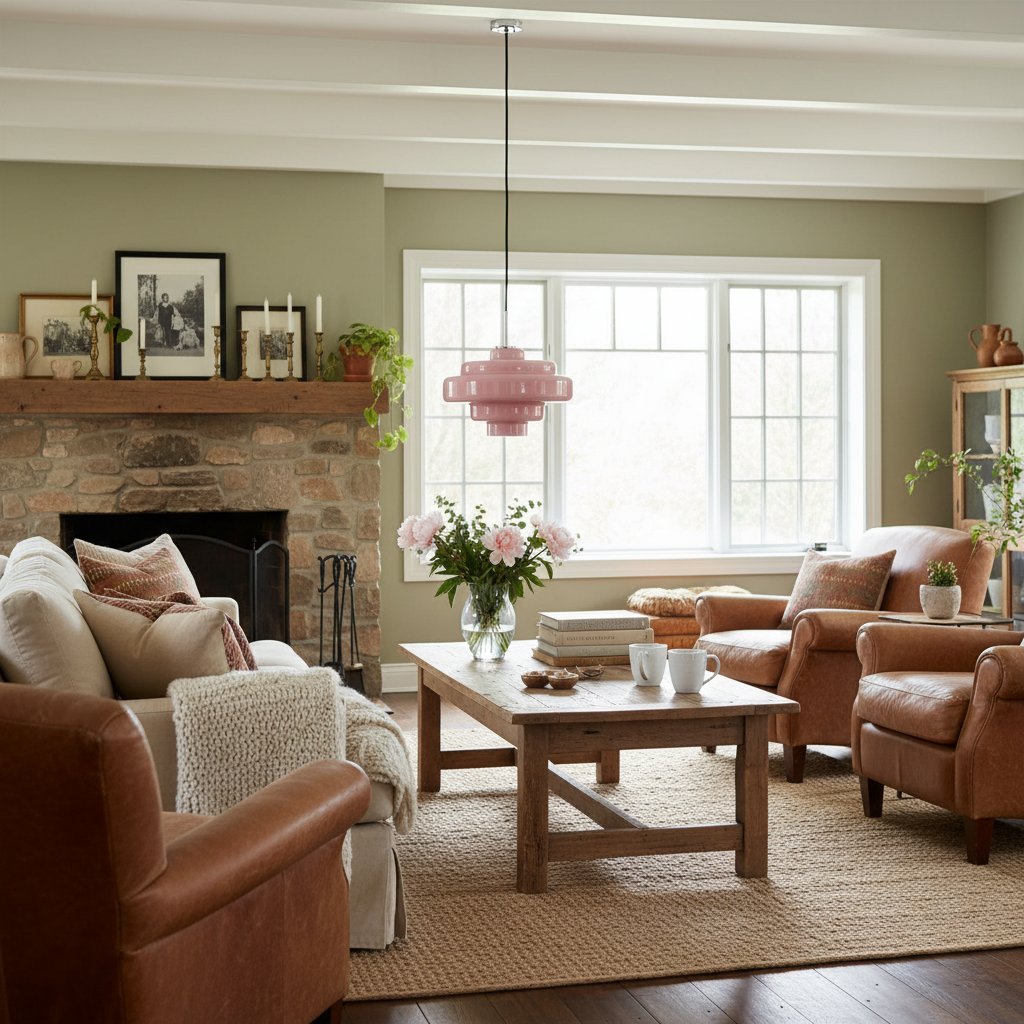
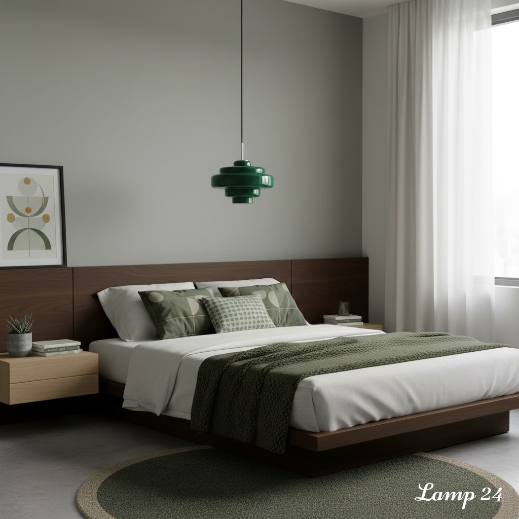
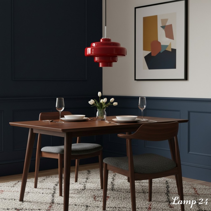
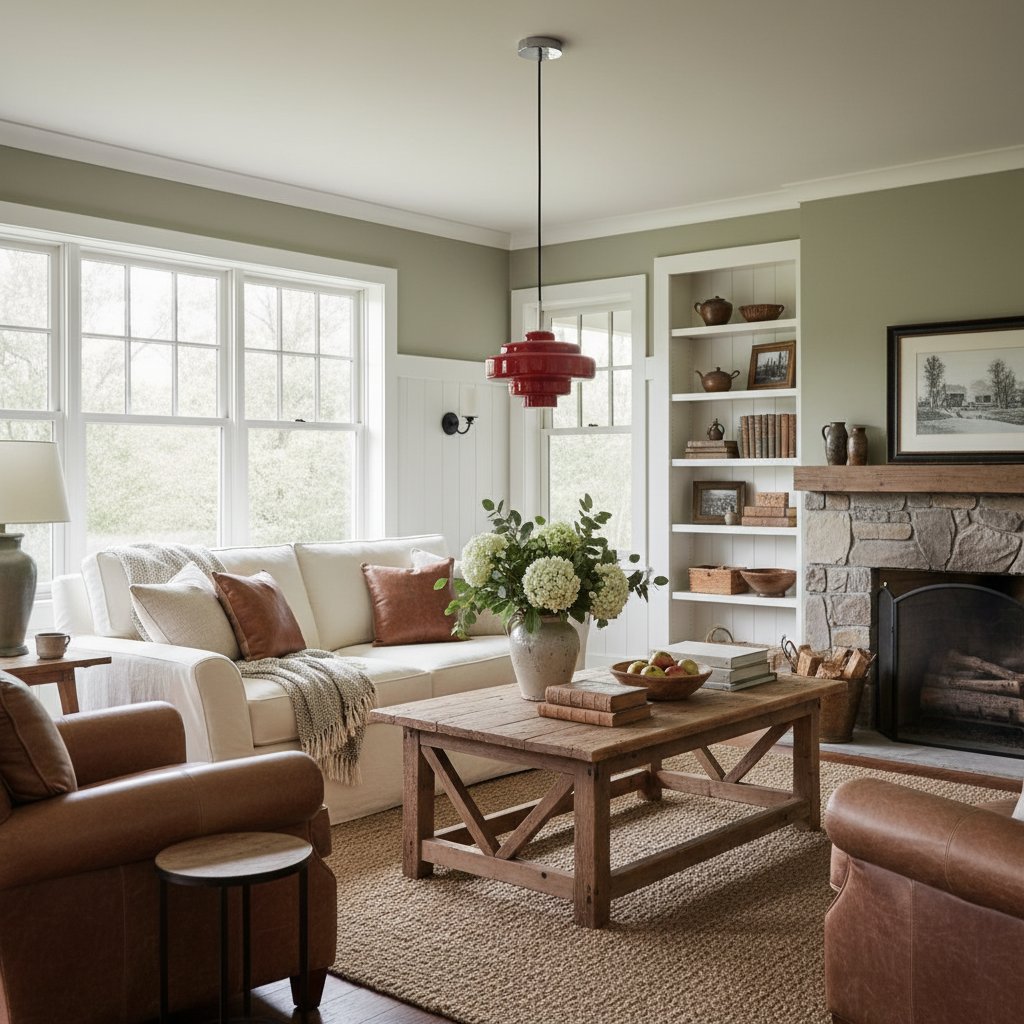
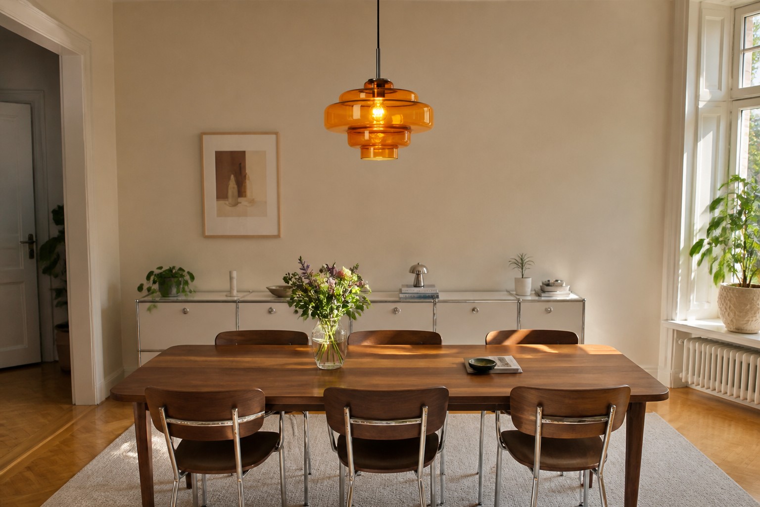
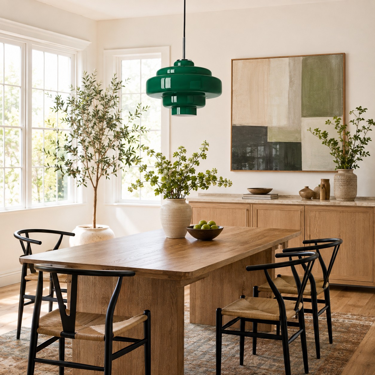
Choose glass that either supports the dominant temperature or creates one intentional contrast. Amber and orange reinforce warm timber and cream surfaces. Smoke grey works naturally with cool stone, black accents and chrome. Green can bridge warm wood and cool white because it reads as a natural middle tone. Pink or red glass is strongest when the surrounding palette is restrained.
Action: place material samples, paint cards or photographs of the main finishes together in daylight. Remove small accessories from the decision. If the group feels mostly golden, earthy or creamy, begin with warm glass. If it feels crisp, mineral or monochrome, test smoke, white or a controlled contrasting colour.
Step 2: Choose a Glass Colour That Connects, Not Copies
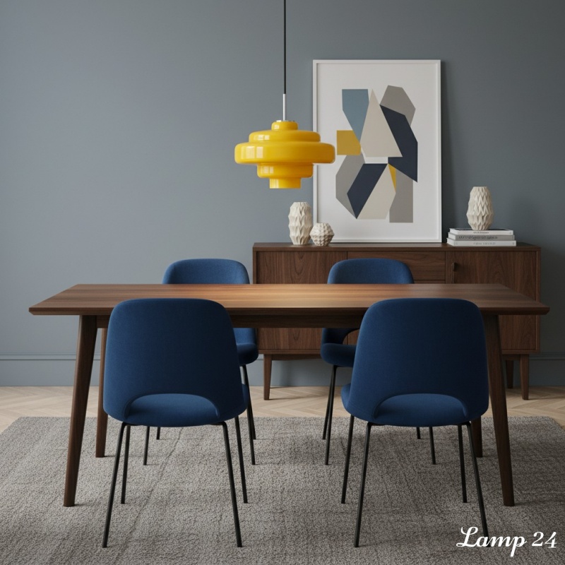
A direct colour match can look forced because glass changes with daylight and the bulb behind it. Instead, choose a related tone. An amber pendant above walnut can be slightly lighter than the wood. Green glass can sit beside oak because both feel natural, even though the colours differ. Smoke glass can repeat the depth of black hardware without turning the ceiling into a dark block.
If you are deciding between warm and cool shades, use Orange, Amber or Smoke Grey? How to Choose a Glass Pendant Light Colour as the detailed colour test. For this furniture-matching decision, the short rule is simple: repeat the room's undertone, not its exact surface colour.
Check the shade twice - once with the pendant unlit and once with a warm bulb. Coloured glass may look brighter during the day and deeper at night. A shade that works in both conditions is more dependable than one chosen from a single product photograph.
Compare the Koloro glass colour options
Step 3: Match Metal Details Through Repetition
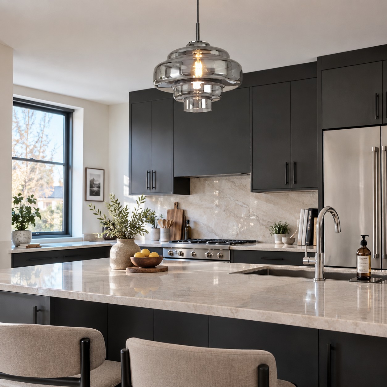
The metal part of a pendant is usually smaller than the shade, but it helps the fixture belong in the room. Repeat its finish once or twice at a similar visual level. Chrome pendant details can relate to a chrome tap, polished cabinet handles or slim metal chair legs. They do not require every metal object to be identical.
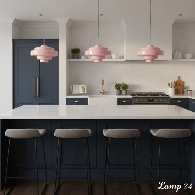
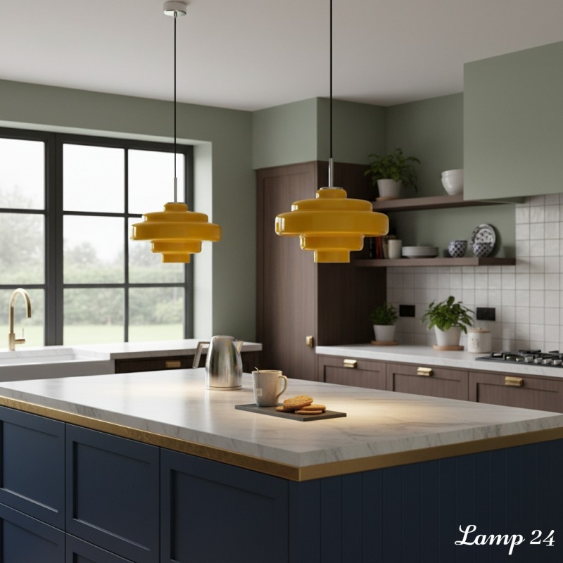
Mixed metals work when one finish is dominant and the second looks deliberate. For example, a kitchen may use brushed brass handles as the main finish while a pendant with chrome details relates to stainless appliances and a polished tap. Keep the number of finishes controlled, and avoid placing three unrelated metals within one small view.
Action: trace a visual triangle between the pendant hardware and two existing metal details. If the eye can move between those points naturally, the finish will look integrated rather than accidental.
Step 4: Let Furniture Shape Decide the Pendant's Rhythm
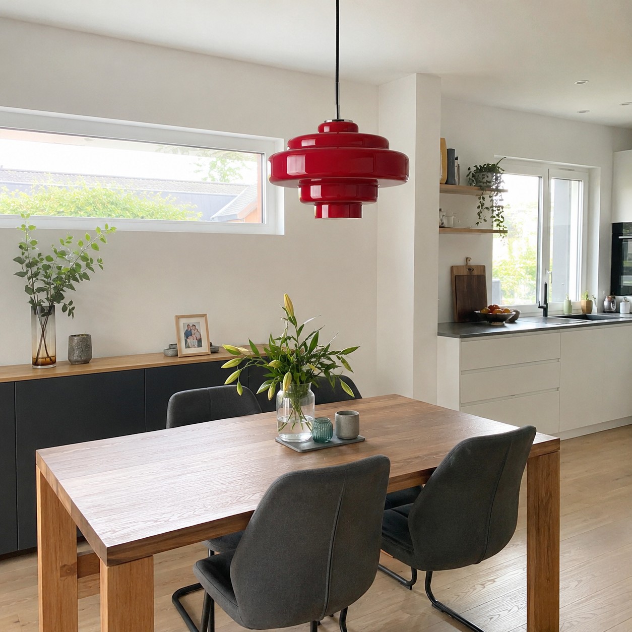
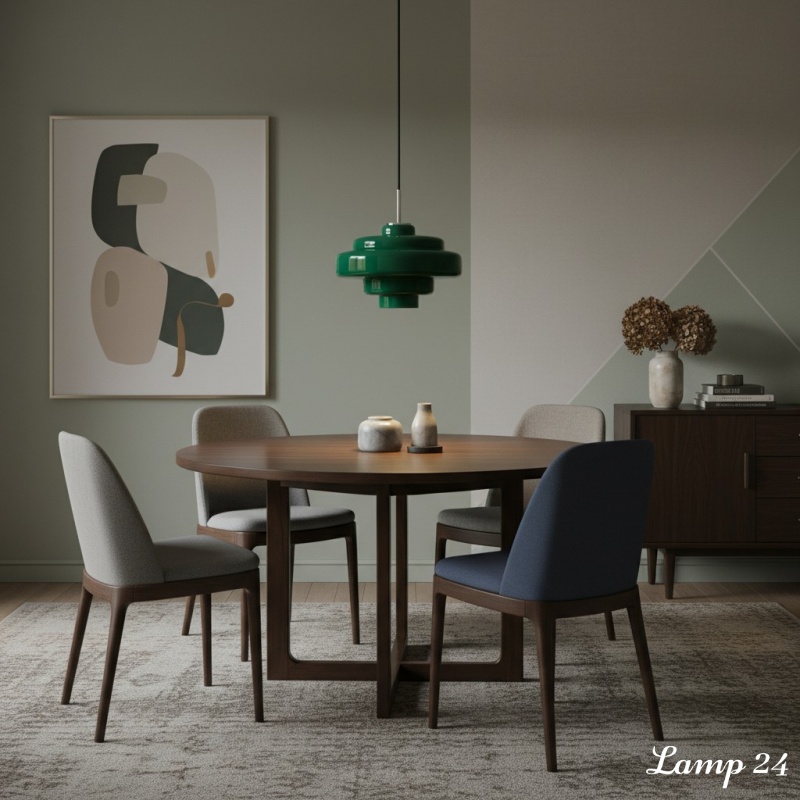
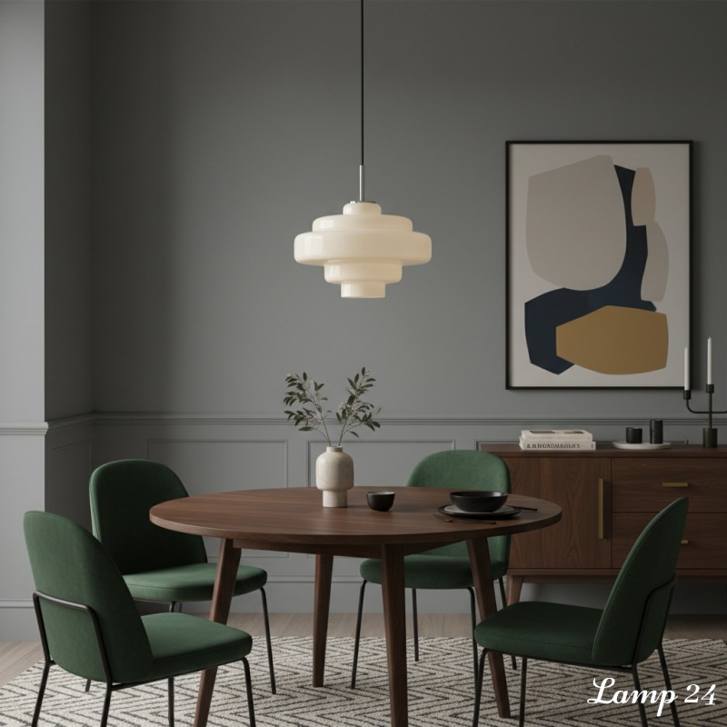
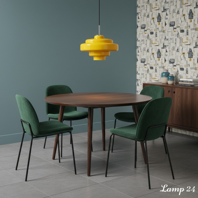
Shape matching is about rhythm, not duplication. A rounded glass shade can soften a rectangular dining table, straight cabinet fronts or a boxy island. Above a round table, the same curve creates a calmer, more symmetrical composition. Both strategies work; decide whether the room needs softness or repetition.
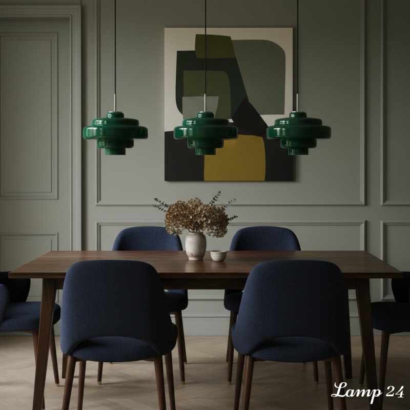
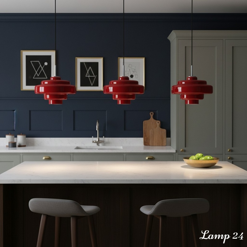
Scale the pendant to the furniture directly below it. The shade should look comfortably narrower than the table or island and leave open sightlines from nearby seats. A 30 cm pendant can suit a compact dining table, breakfast bar or small island, but always test the view from the doorway and seated eye level. For a long surface, use repeated pendants only when each shade has enough breathing room.
- Heavy furniture: transparent or softly tinted glass reduces visual weight.
- Very slim furniture: one rounded shade adds presence without needing more decor.
- Busy wood grain: choose a simple glass colour and clean silhouette.
- Plain white furniture: coloured glass can become the controlled focal point.
Step 5: Check Installation Against Real Use
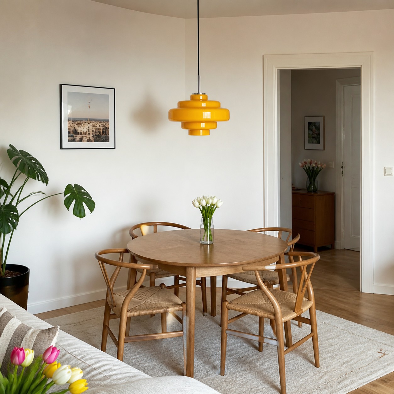
A pendant can match beautifully and still fail if it interrupts movement or casts the wrong light. Confirm the ceiling point, hanging height, table position and bulb before installation. Adjustable suspension helps relate the fixture to different furniture heights, while a warm diffused bulb keeps coloured glass comfortable.
In rental homes, furniture may move while the ceiling point stays fixed. The practical zoning ideas in Pendant Lighting Ideas for Rental Flats That Still Feel Personal show how one pendant can anchor a table or corner without relying on permanent decorative changes. Use the same logic here: centre the light over the activity, not automatically over the room.
The Koloro pendant is hardwired, so confirm the installation point and arrange appropriate installation before purchase. Its adjustable hanging height gives flexibility, but the final position must maintain comfortable headroom and an unobstructed view across the table.
Five Matching Mistakes That Make a Room Feel Unsettled
- Matching every colour exactly: use related undertones so the room feels layered, not staged.
- Choosing from a small accessory: match permanent finishes before cushions, bowls or artwork.
- Ignoring the bulb: test how the shade changes when lit.
- Mixing too many metals: keep one dominant finish and one supporting finish.
- Forgetting the view from other rooms: check the pendant from entrances and open-plan seating areas.
Your Final Furniture-and-Finish Checklist
- The pendant relates to at least two permanent room finishes.
- The glass supports or intentionally contrasts the dominant undertone.
- The metal detail repeats elsewhere without forcing every finish to match.
- The shade shape balances the furniture below it.
- The size leaves comfortable sightlines and breathing room.
- The colour works in daylight and with the chosen bulb.
- The ceiling point, hanging height and installation method are confirmed.
- Nearby accessories stay quiet enough for the pendant to remain the focal point.
A Flexible Match for Wood, Stone and Modern Hardware
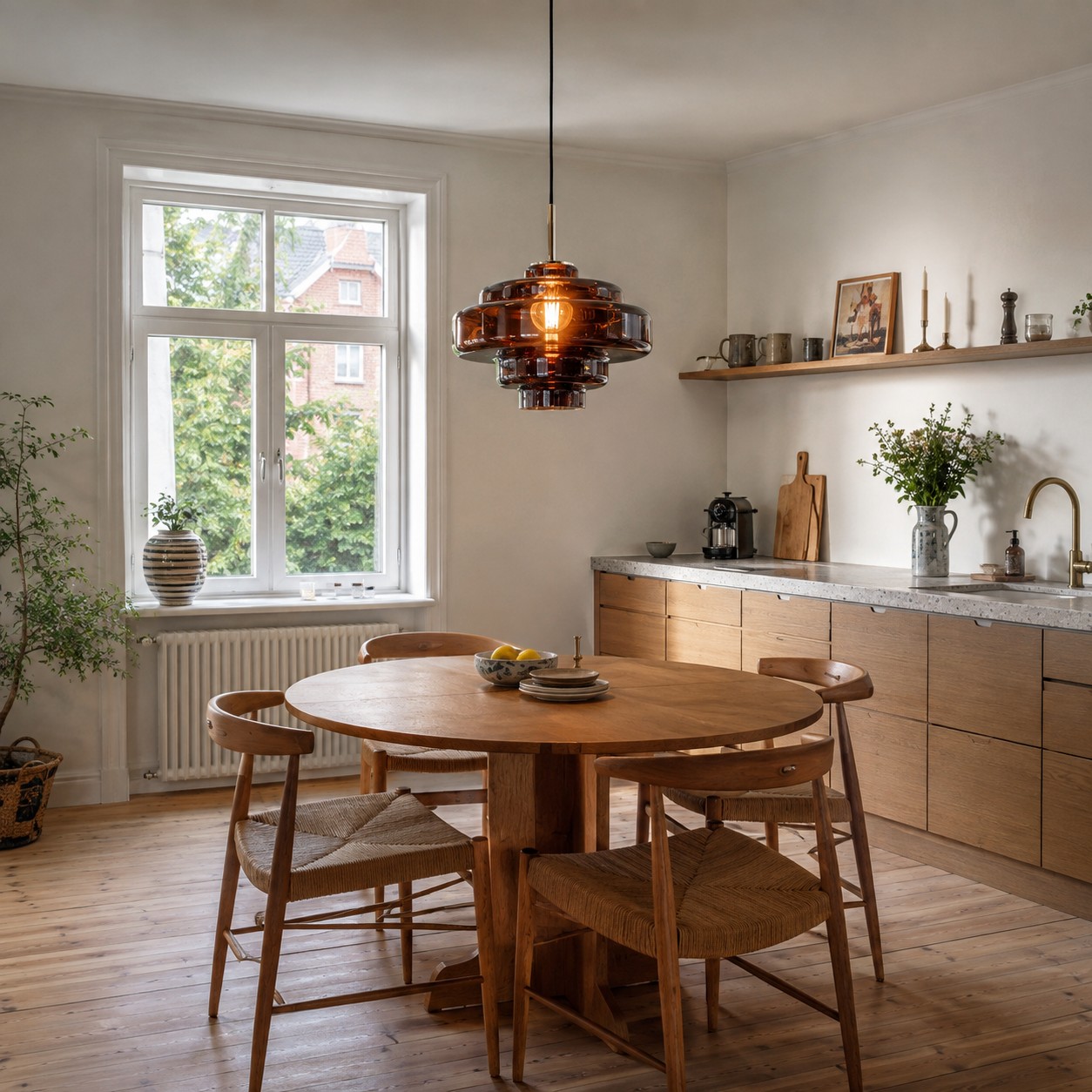
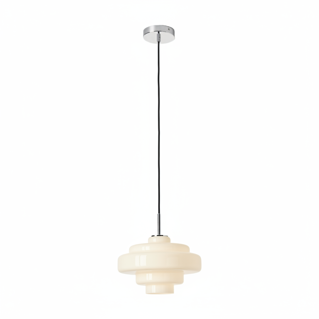
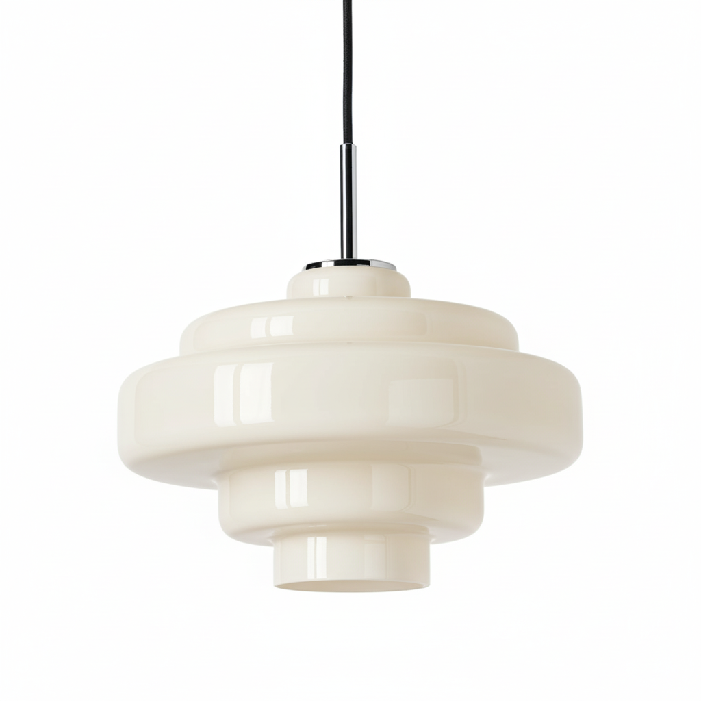
The Koloro Retro-Inspired Colored Glass Pendant combines a 30 cm glass shade with rounded 1970s-inspired edges, chrome details and a black textile-covered cord. Those features make it adaptable: the glass can connect with timber and colour, while the chrome can relate to taps, handles or appliances. The smooth outline also works with both curved and straight furniture.
Choose the colour after completing the room inventory rather than before it. Then treat the pendant as one strong decision and simplify the details around it. Explore the Koloro pendant once you have identified the room's dominant timber, surface and metal finish.
FAQ: Matching Glass Pendant Lights
Should pendant metal match cabinet handles?
Not exactly, but repeating the finish once or twice helps the room feel connected.
What glass colour works best with oak furniture?
Amber and green are natural partners; smoke grey creates a cooler contrast.
Can coloured glass work with a marble worktop?
Yes. Match the marble's warm or cool undertone rather than every vein colour.
Can I mix chrome lighting with brass furniture details?
Yes, if one finish is dominant and chrome is repeated in another visible element.
Should the pendant match the table shape?
It can, but contrast also works: a rounded shade often softens a rectangular table.