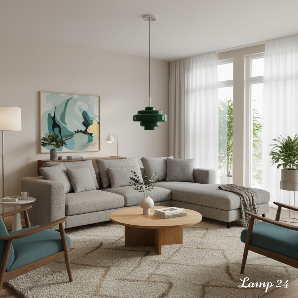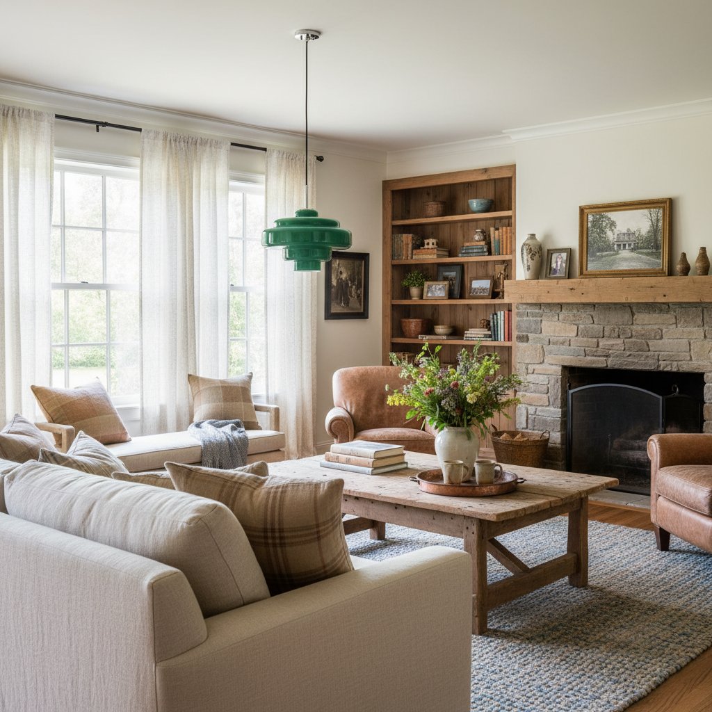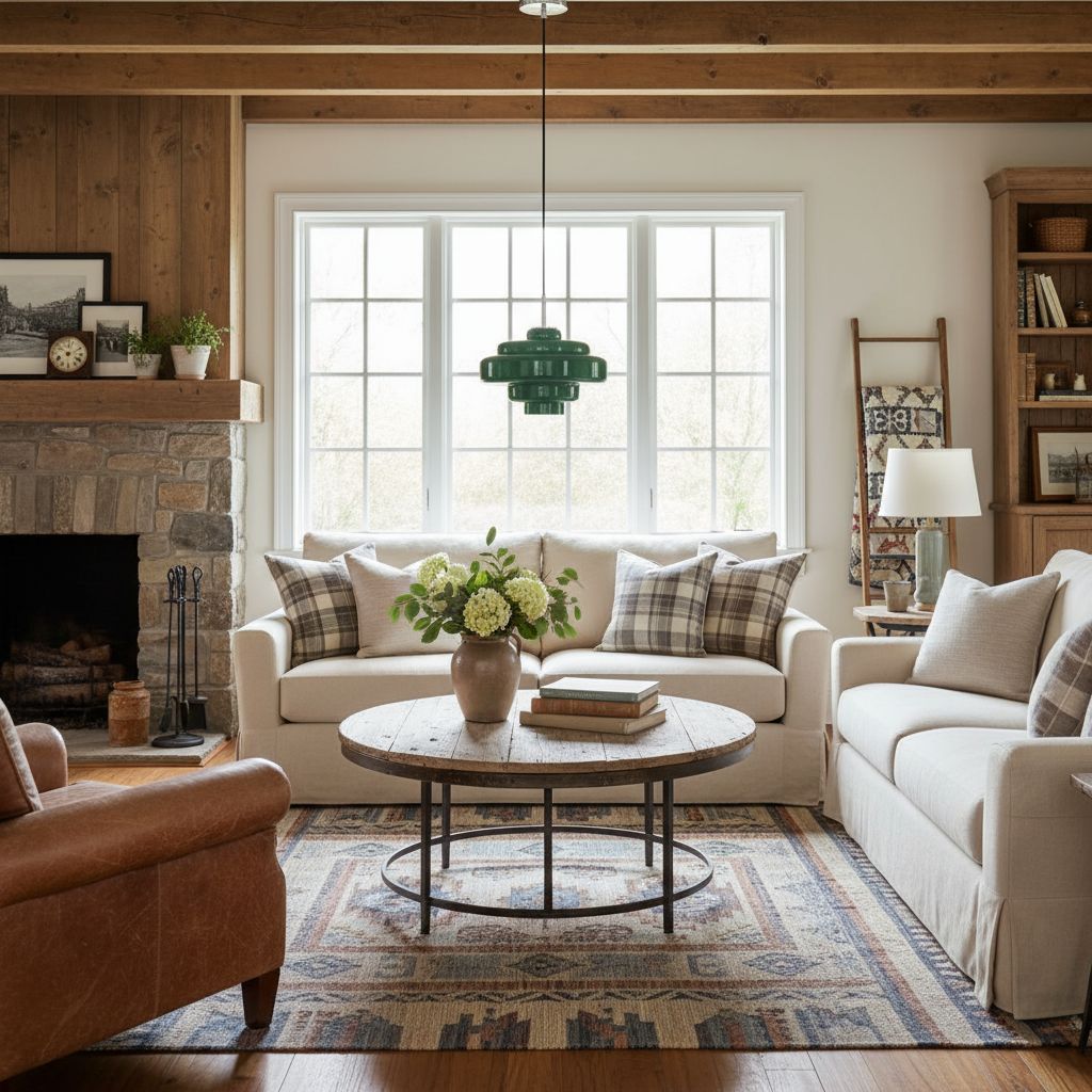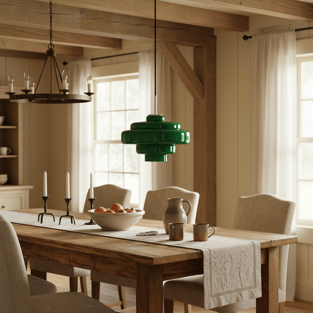
Orange, Amber or Smoke Grey? Let the Room Choose the Glass
Orange is the lively choice, amber is the easygoing one and smoke grey is the quieter, sharper option. That sounds simple until the pendant is hanging in your actual room, where oak, stone, paint, daylight and the view from the sofa all have an opinion. The best colour is not the prettiest swatch on a product page. It is the one that still looks convincing when the light is off at lunchtime and switched on after dinner.
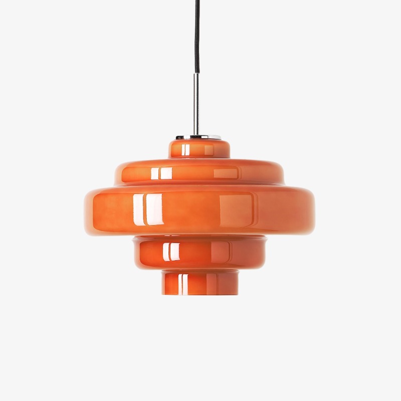
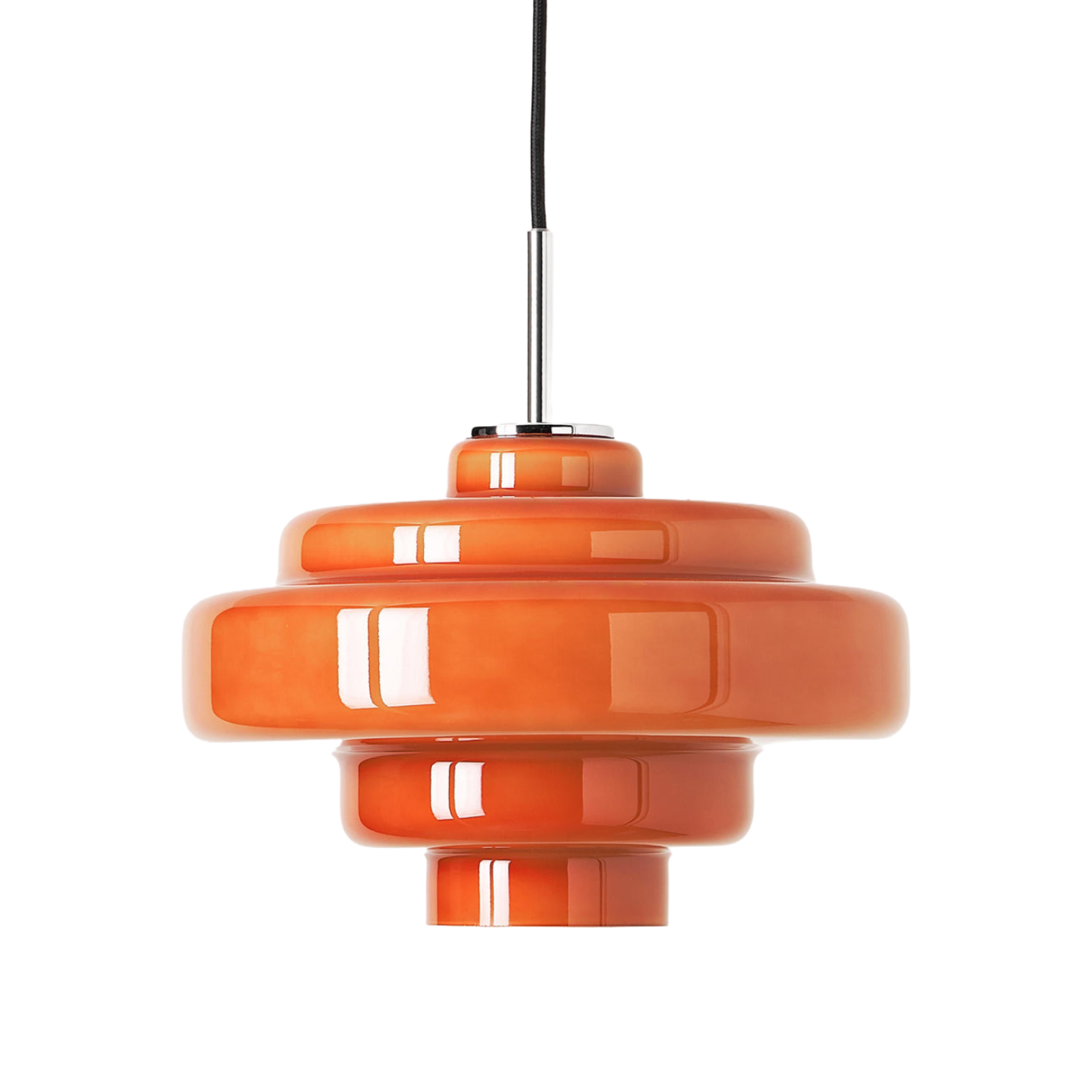
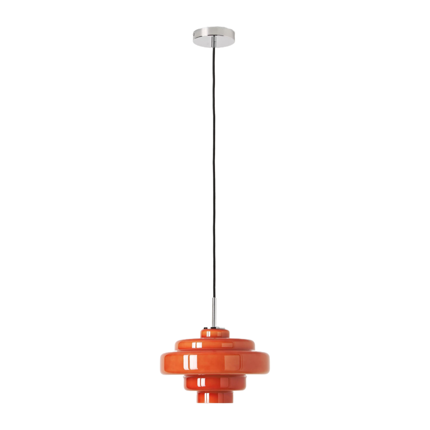
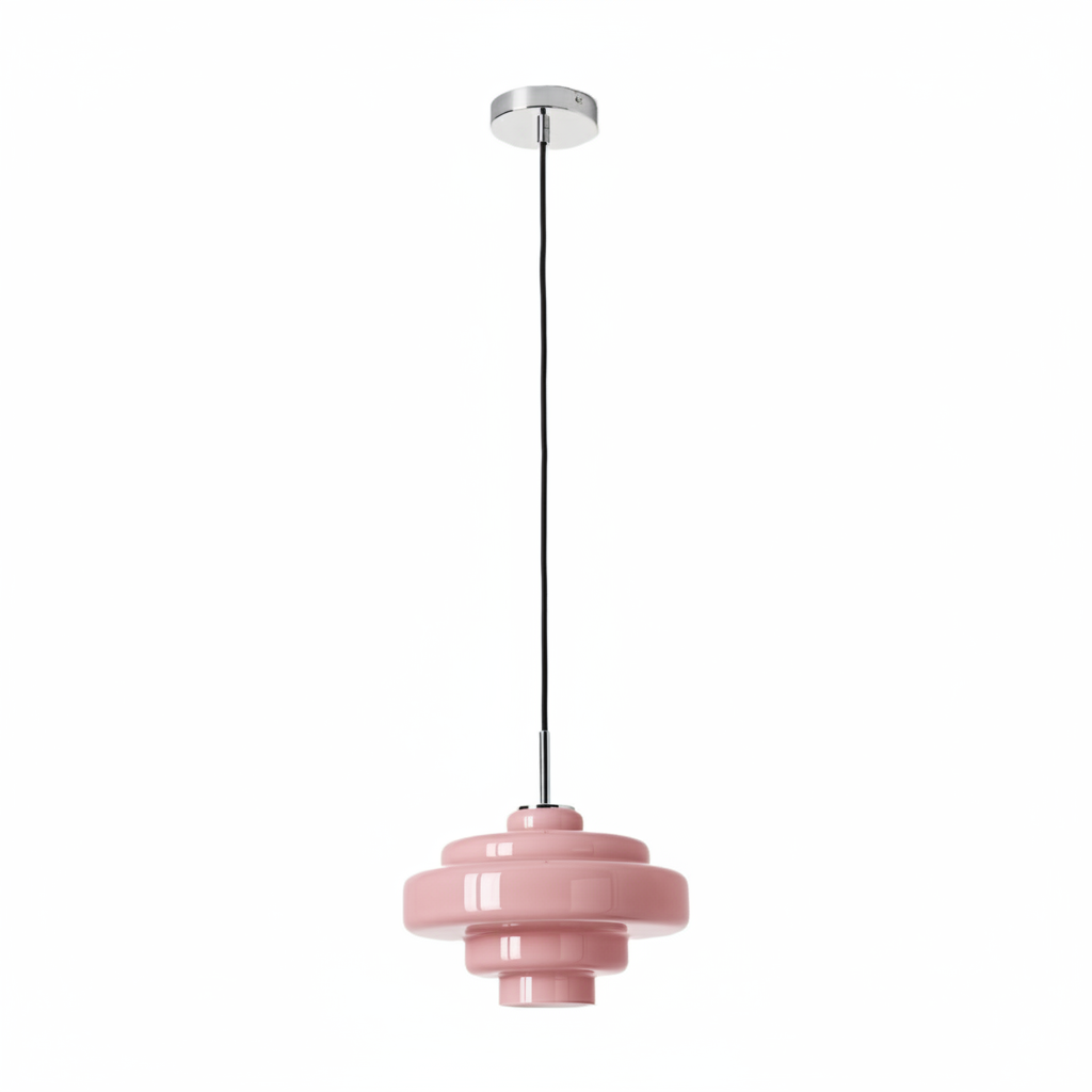
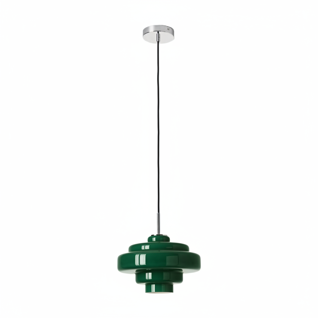
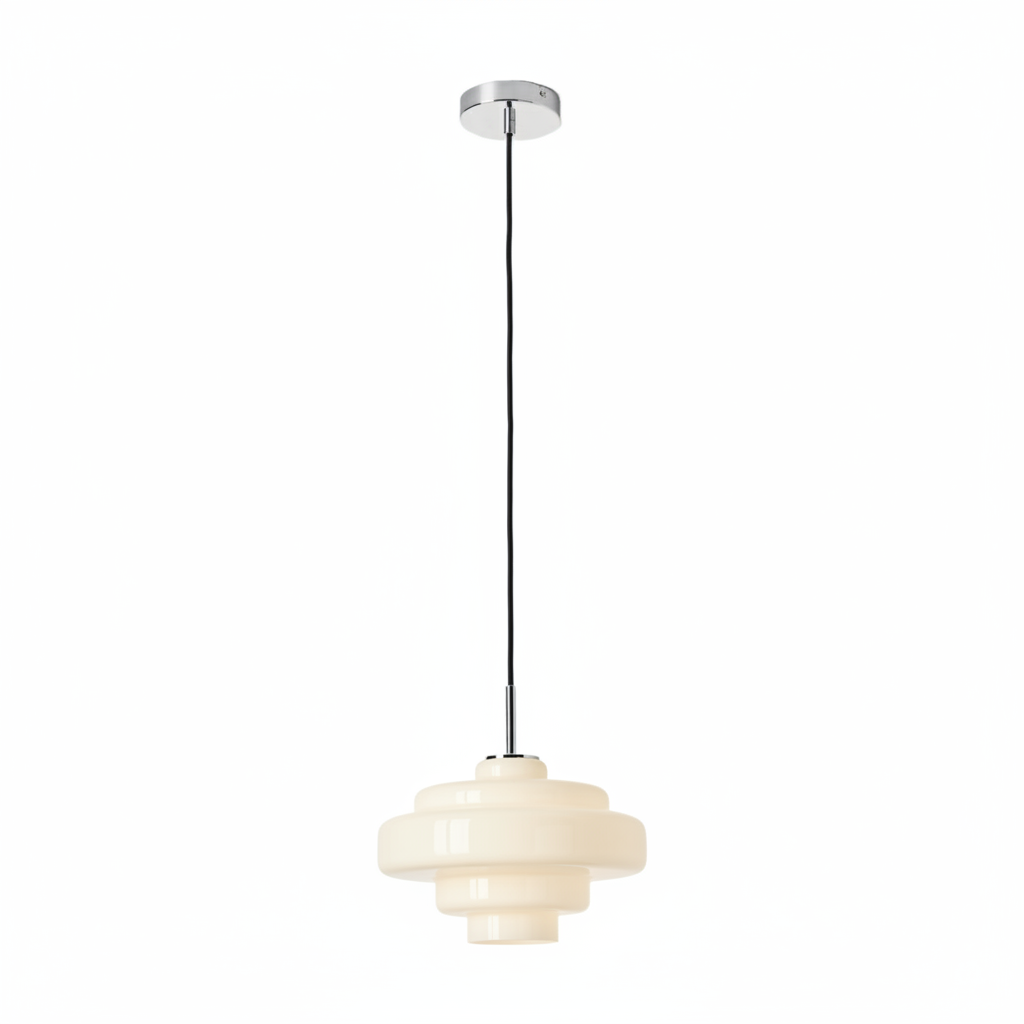
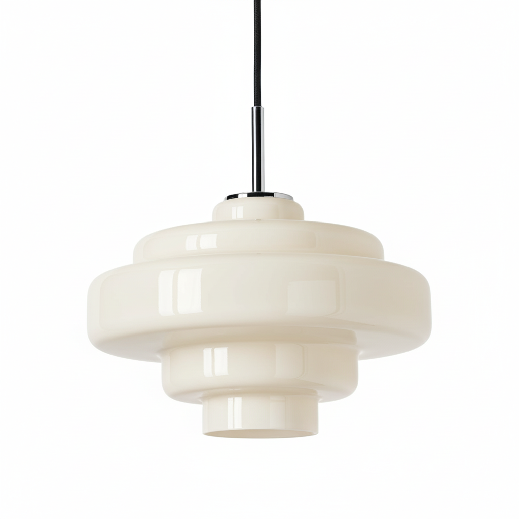
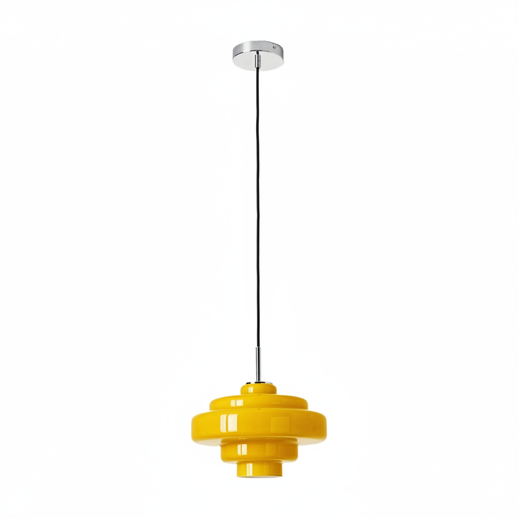
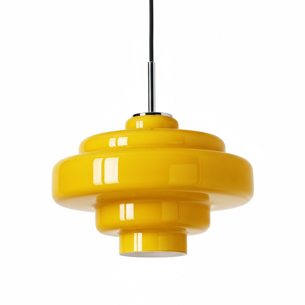
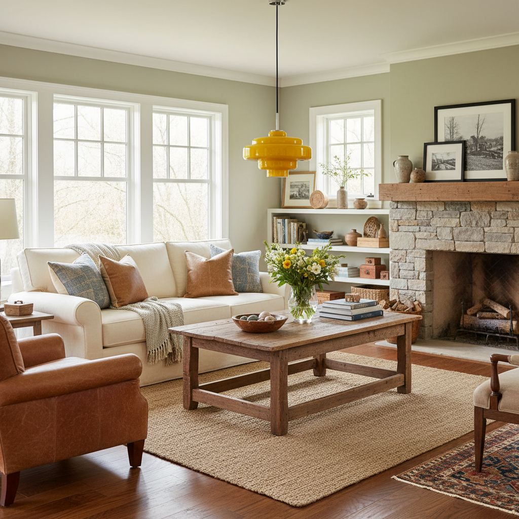
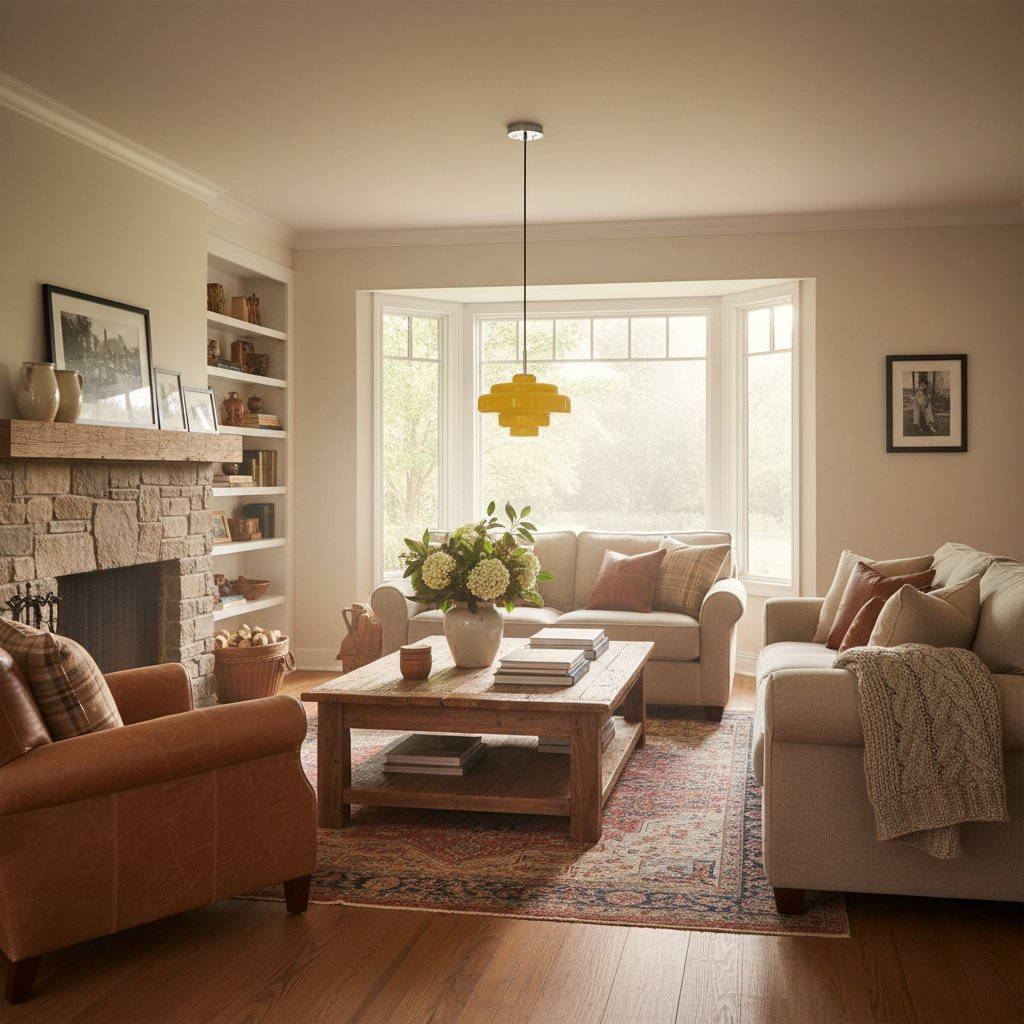
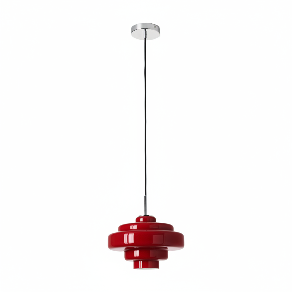
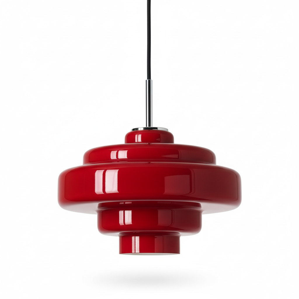
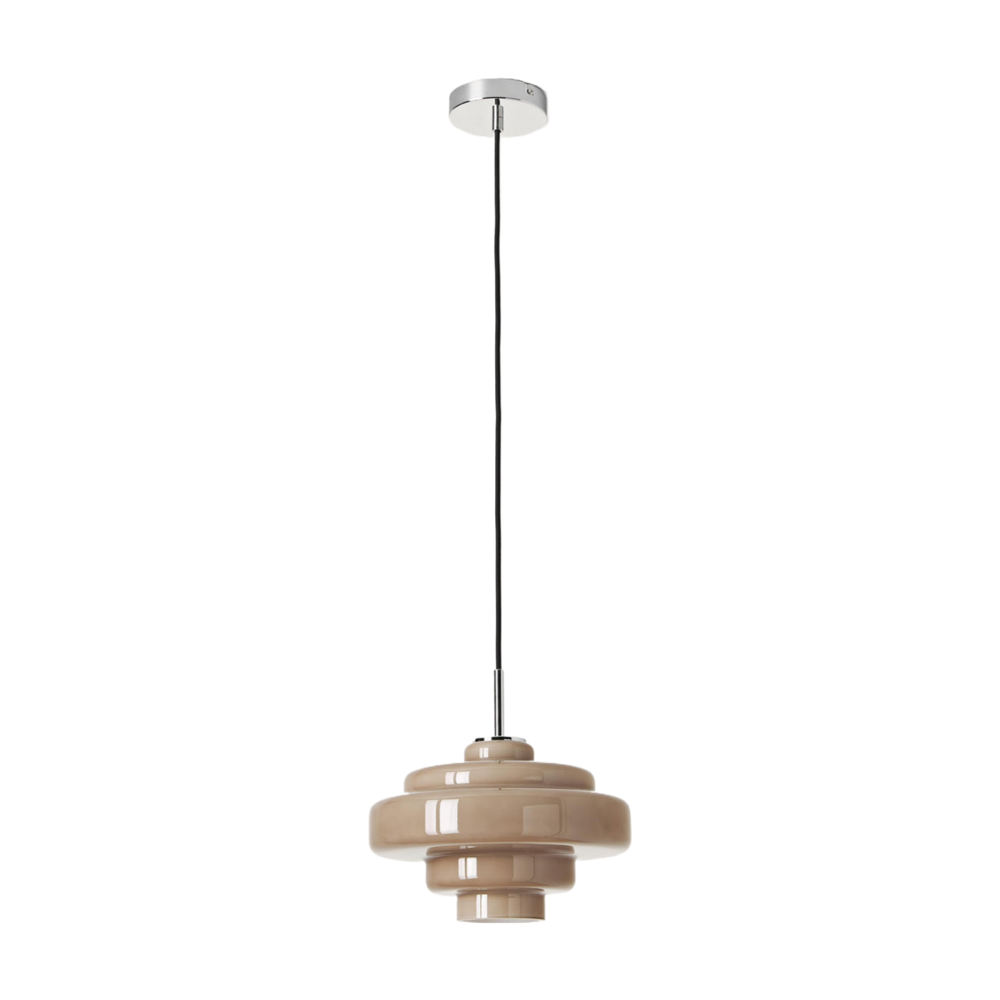
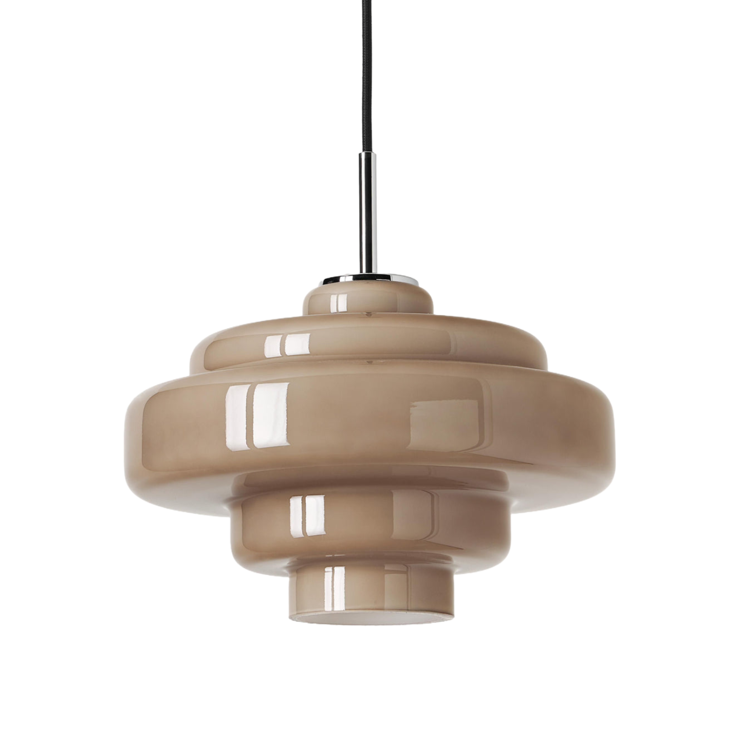
The Koloro Millie Glass Pendant Light makes a useful case study because the same rounded 30 cm glass form is available in orange, amber glass and smoke grey glass. With the silhouette held constant, you can concentrate on what colour does to the room rather than being distracted by three different designs.
Start with the Room, Not a Colour Personality Quiz
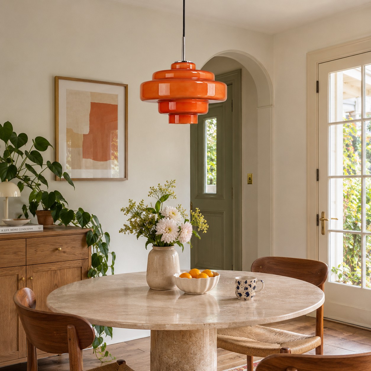
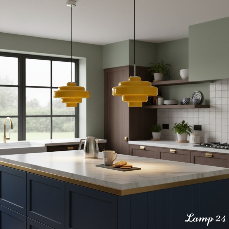
Stand where you normally enter the room and identify the three surfaces you notice first. In a dining area, that may be the table, the floor and the wall behind it. In a kitchen, it is more likely to be the worktop, cabinet fronts and splashback. These large, fixed materials deserve more influence than a fruit bowl, a cushion or a print you might replace next season.
Try this before choosing: photograph the proposed ceiling position in daylight, at dusk and with the room lights on. Add a rough orange, amber and charcoal circle to each image. It is not a glamorous mood board, but it quickly reveals whether the pendant should brighten the composition, blend with it or add contrast.
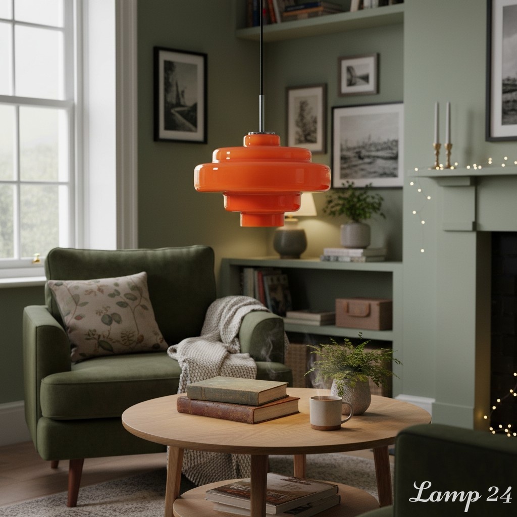
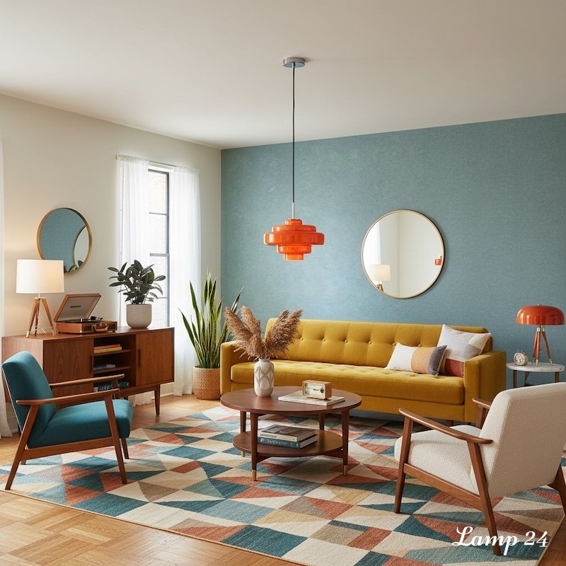
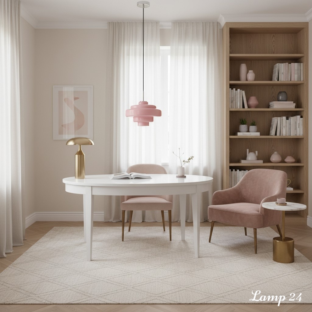
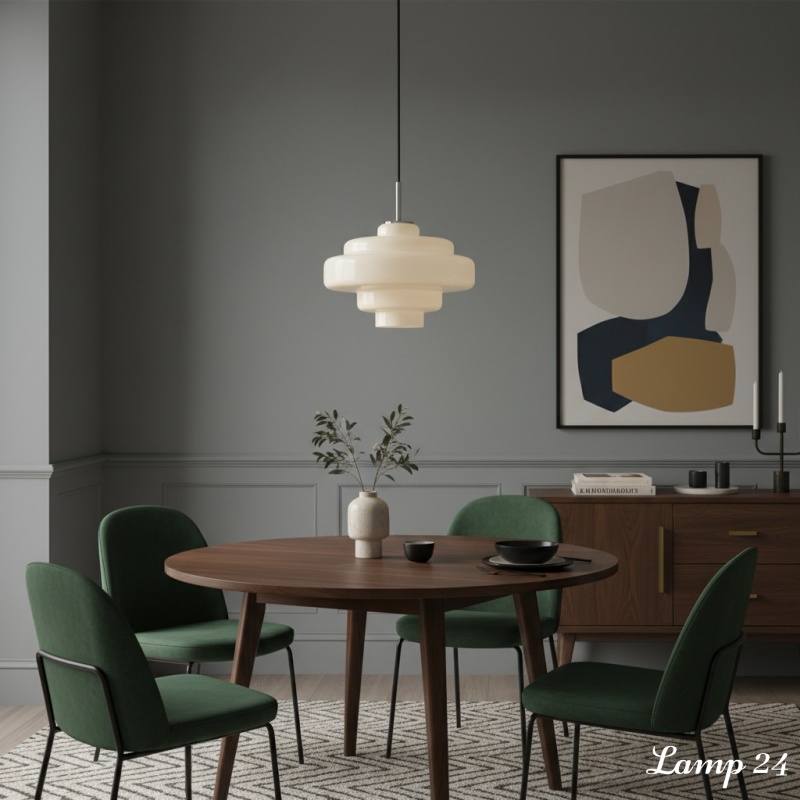
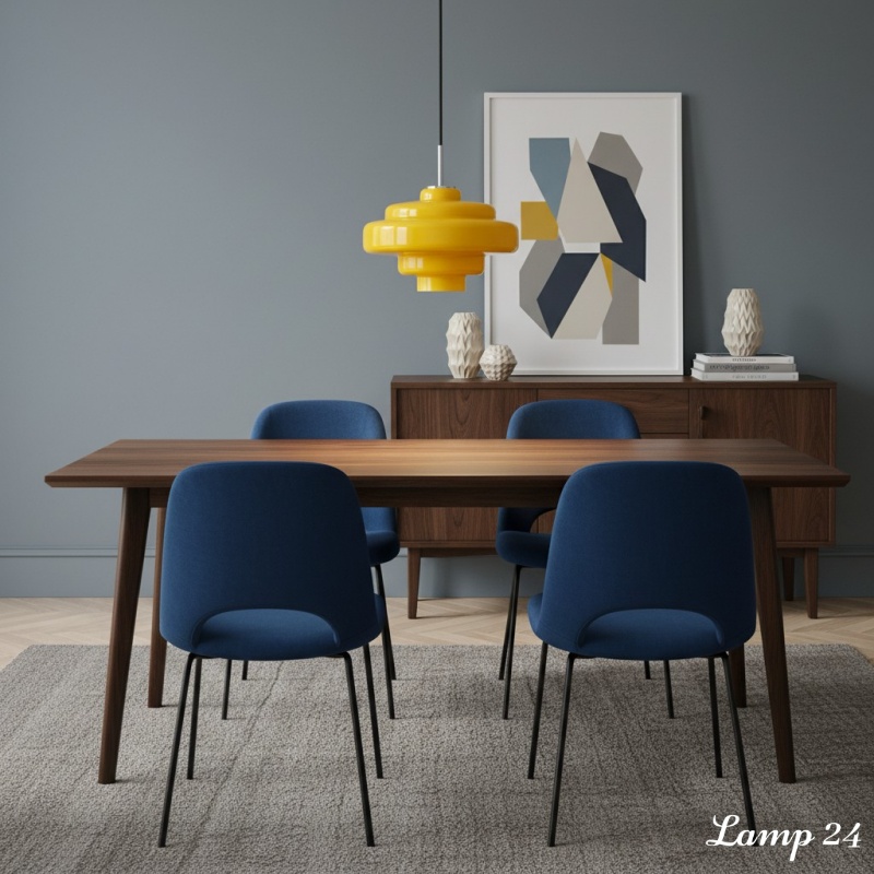
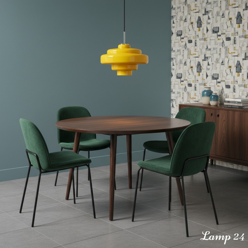
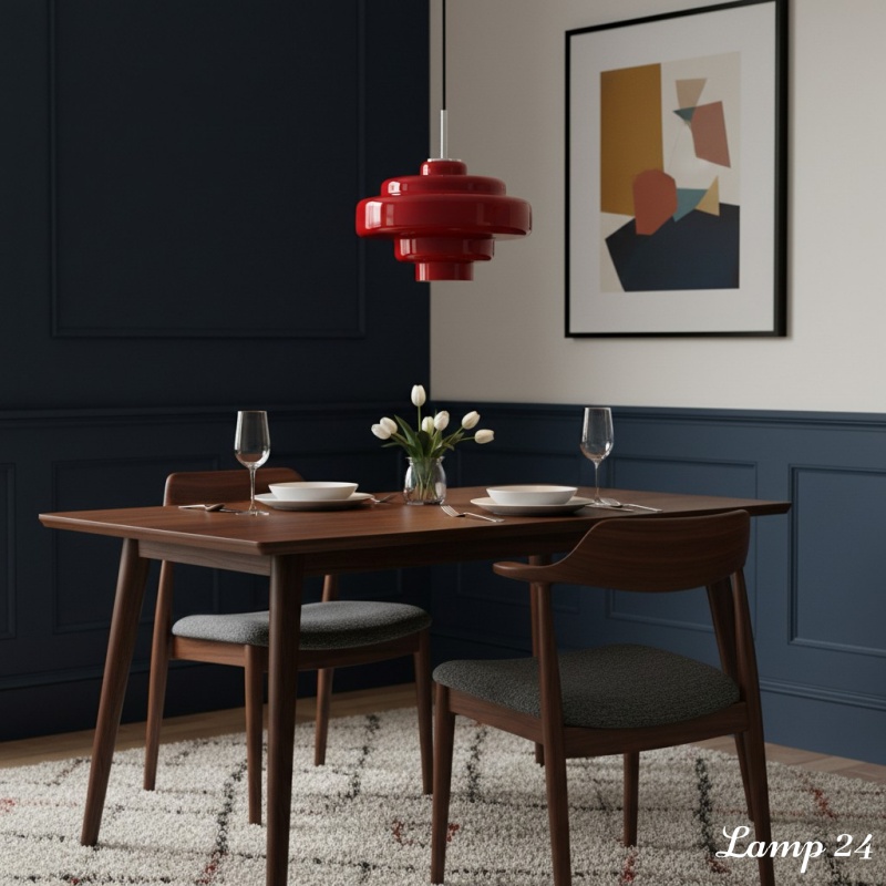
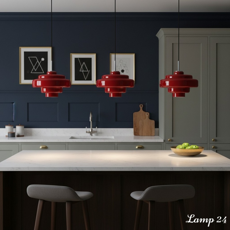
Then check the shade against its background. A smoky tint can disappear elegantly against a pale wall yet lose definition against dark cabinetry. Orange can look rich beside warm timber and unexpectedly crisp against blue-green paint. Amber is forgiving around creams and mid-tone woods, but in a room already full of yellow-brown finishes it may need a cooler wall or chrome detail to keep the scheme from becoming too sweet.
Orange: The Colour That Walks into the Room First
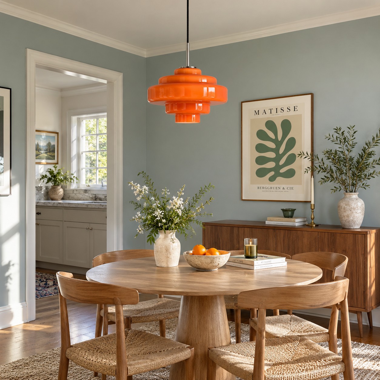
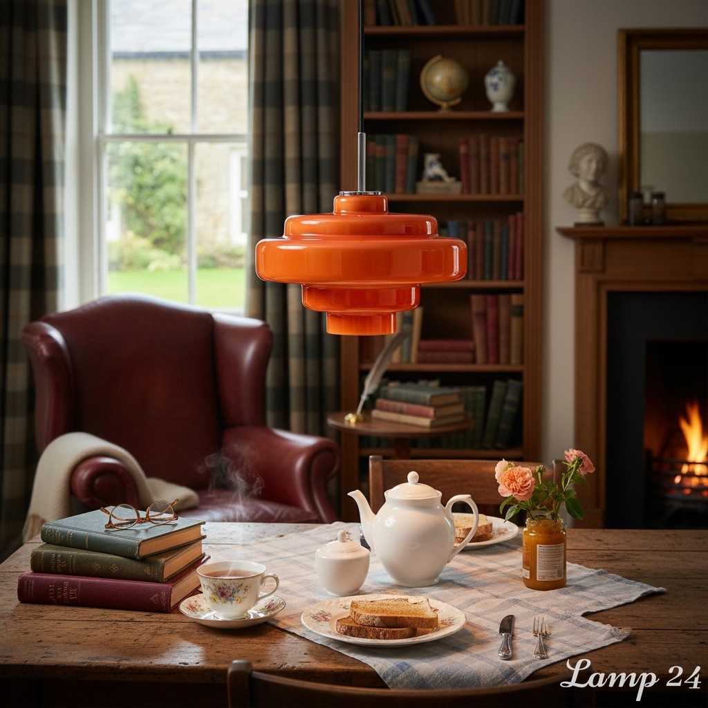
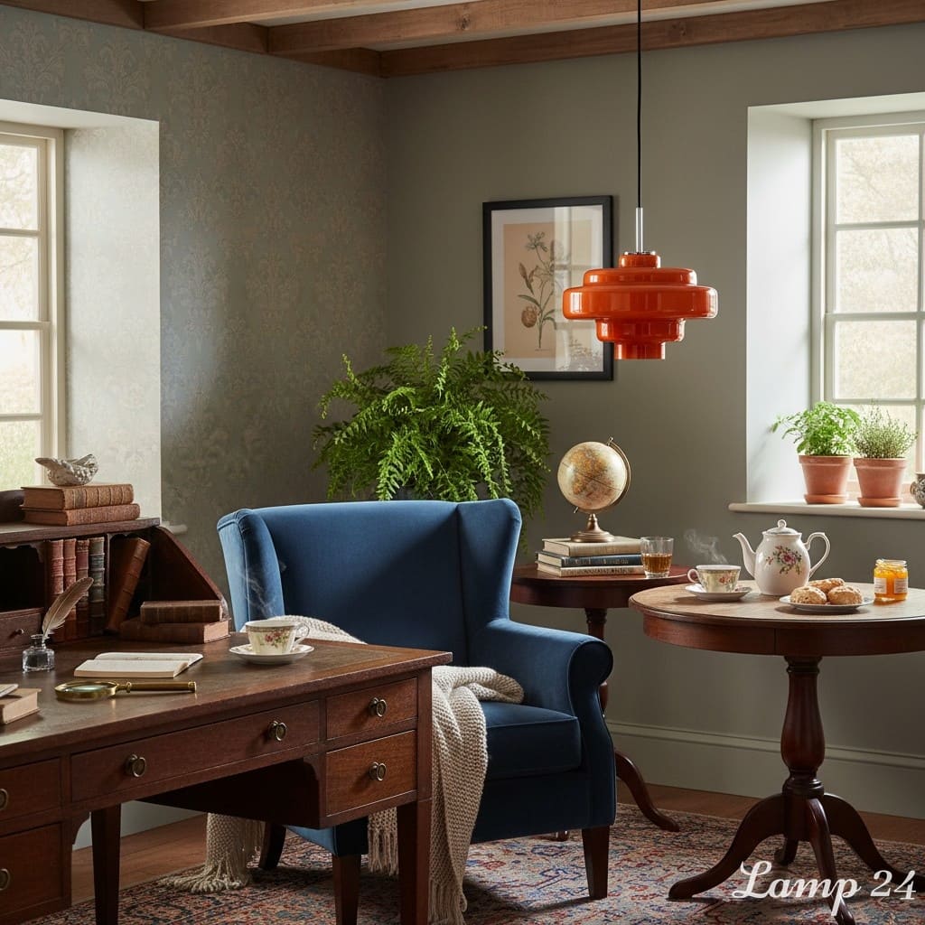
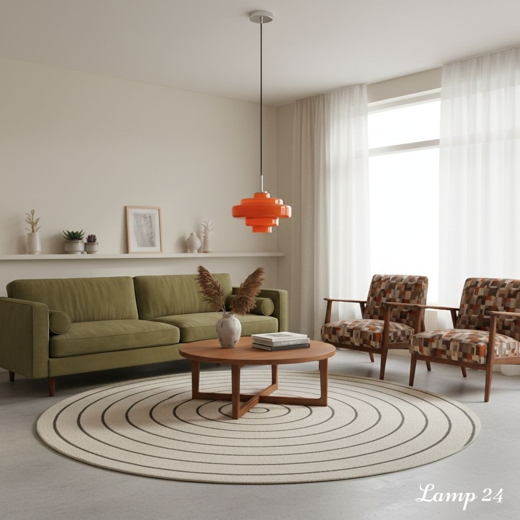
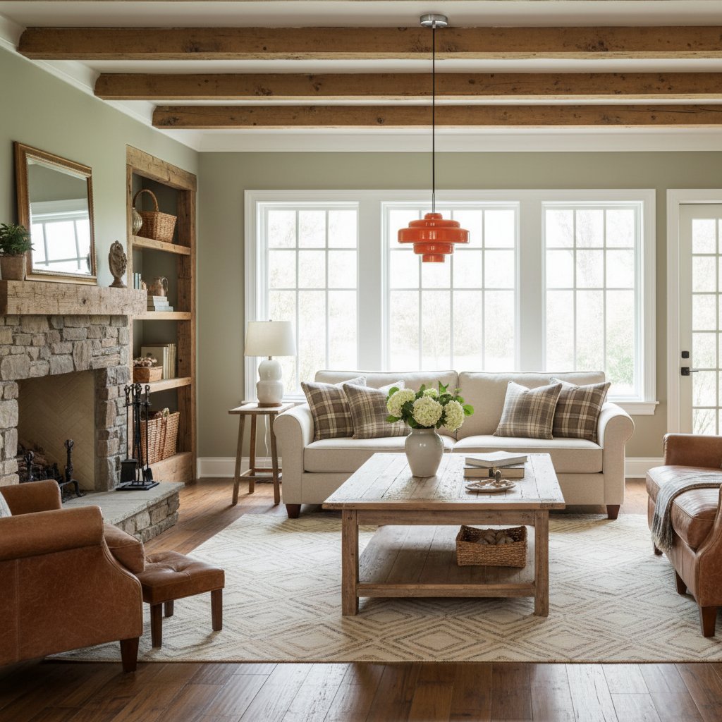
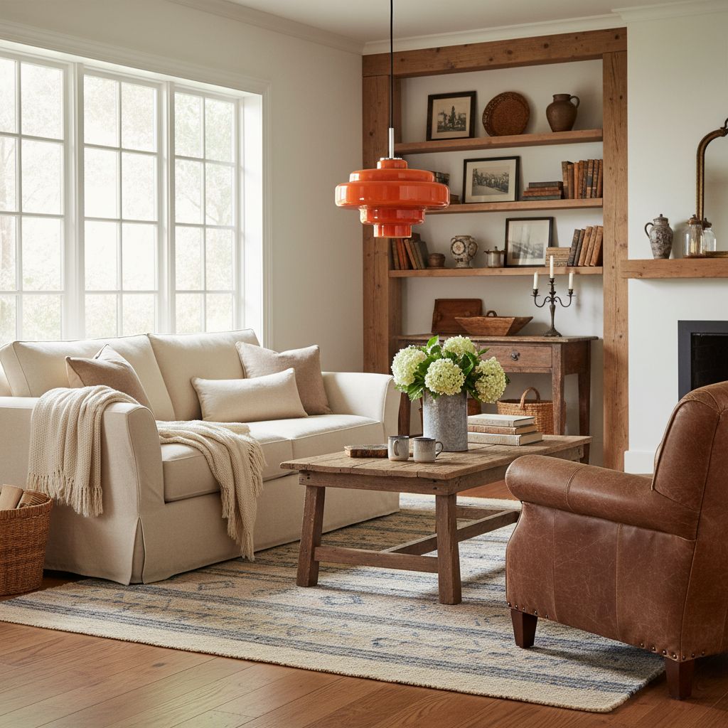
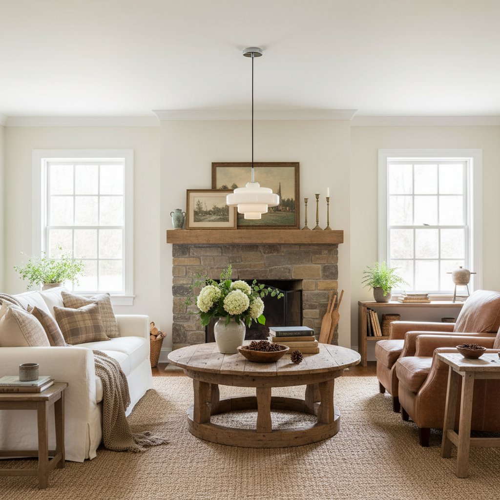
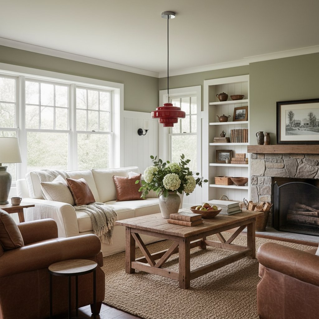
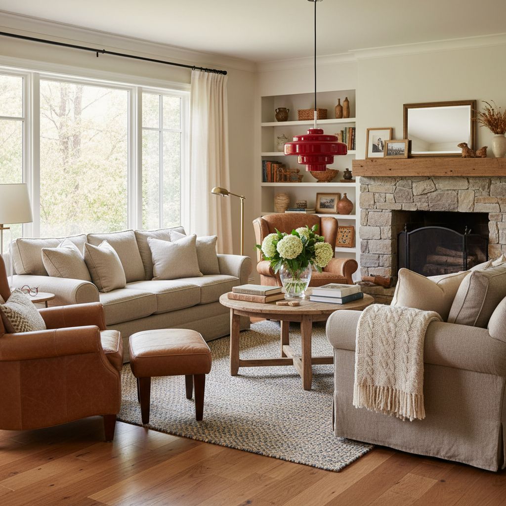
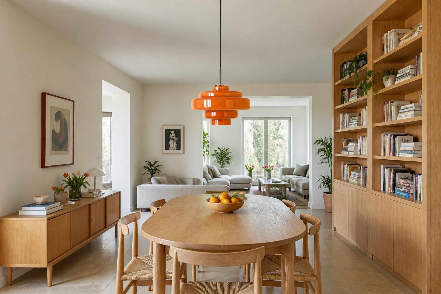
Choose orange when the room needs one decisive note. It works especially well when the architecture and furniture are restrained: white or soft grey walls, simple oak, pale stone and clean-lined seating give the glass space to be expressive. The colour also has enough presence to hold its own in an open-plan room where a timid pendant would simply vanish into the ceiling.
Orange is less successful when patterned tiles, coloured cabinets and bright artwork are already competing. In that case, quieten the immediate sightline or let the pendant repeat one small existing orange note.
Best use: as the single warm accent in a neutral or cool-leaning room. Check twice: against the wall when unlit and from the adjoining room after dark.
Amber: Warmth Without the Trumpet Fanfare
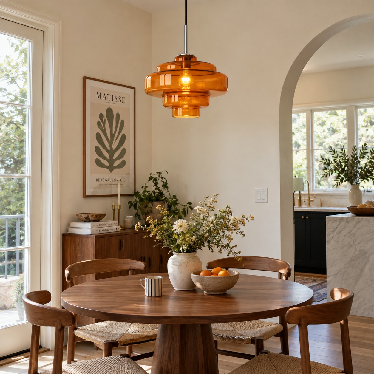
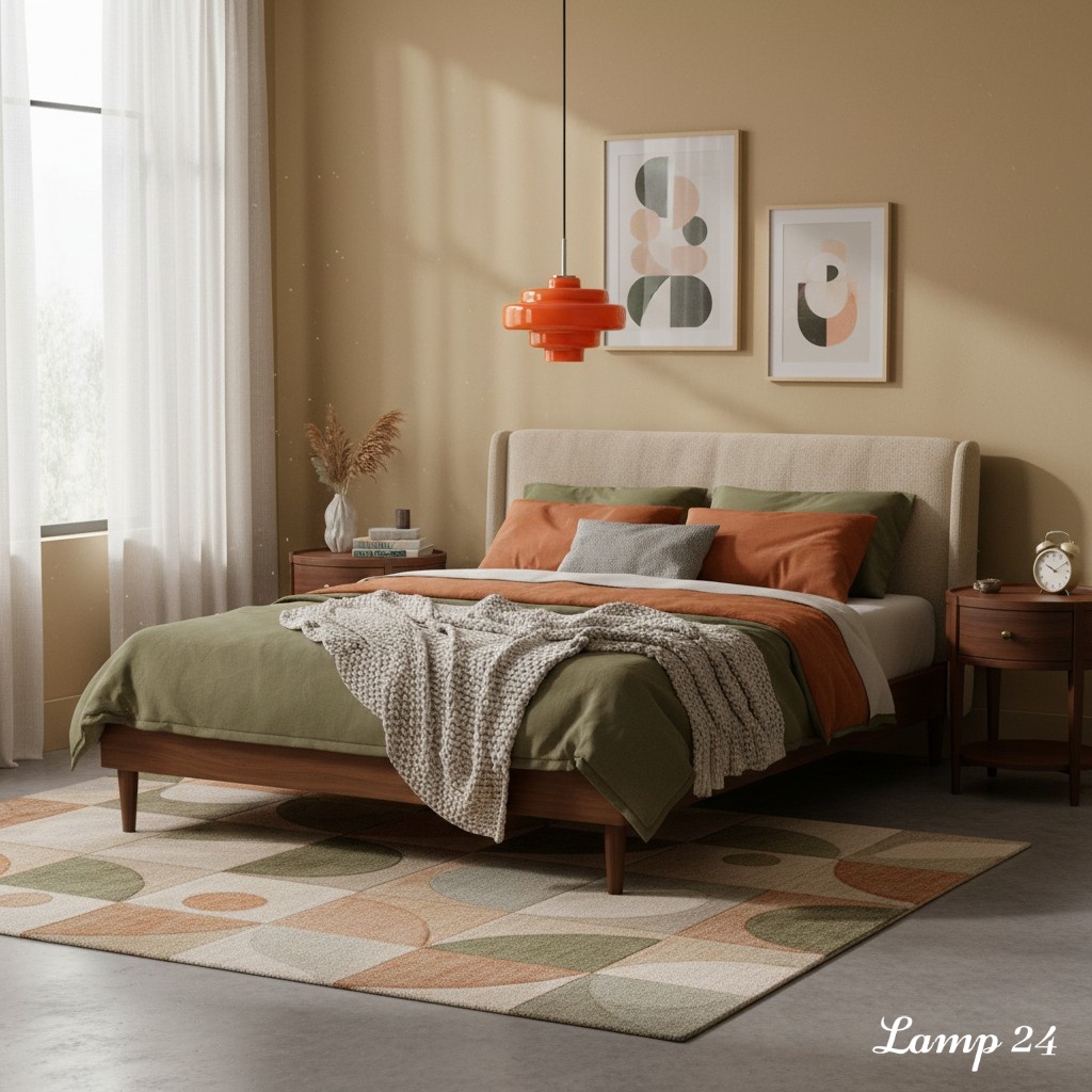
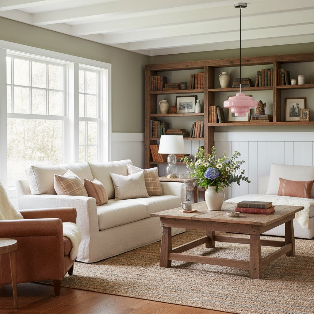
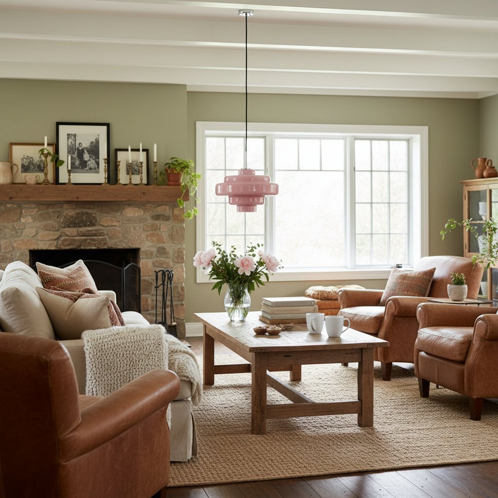
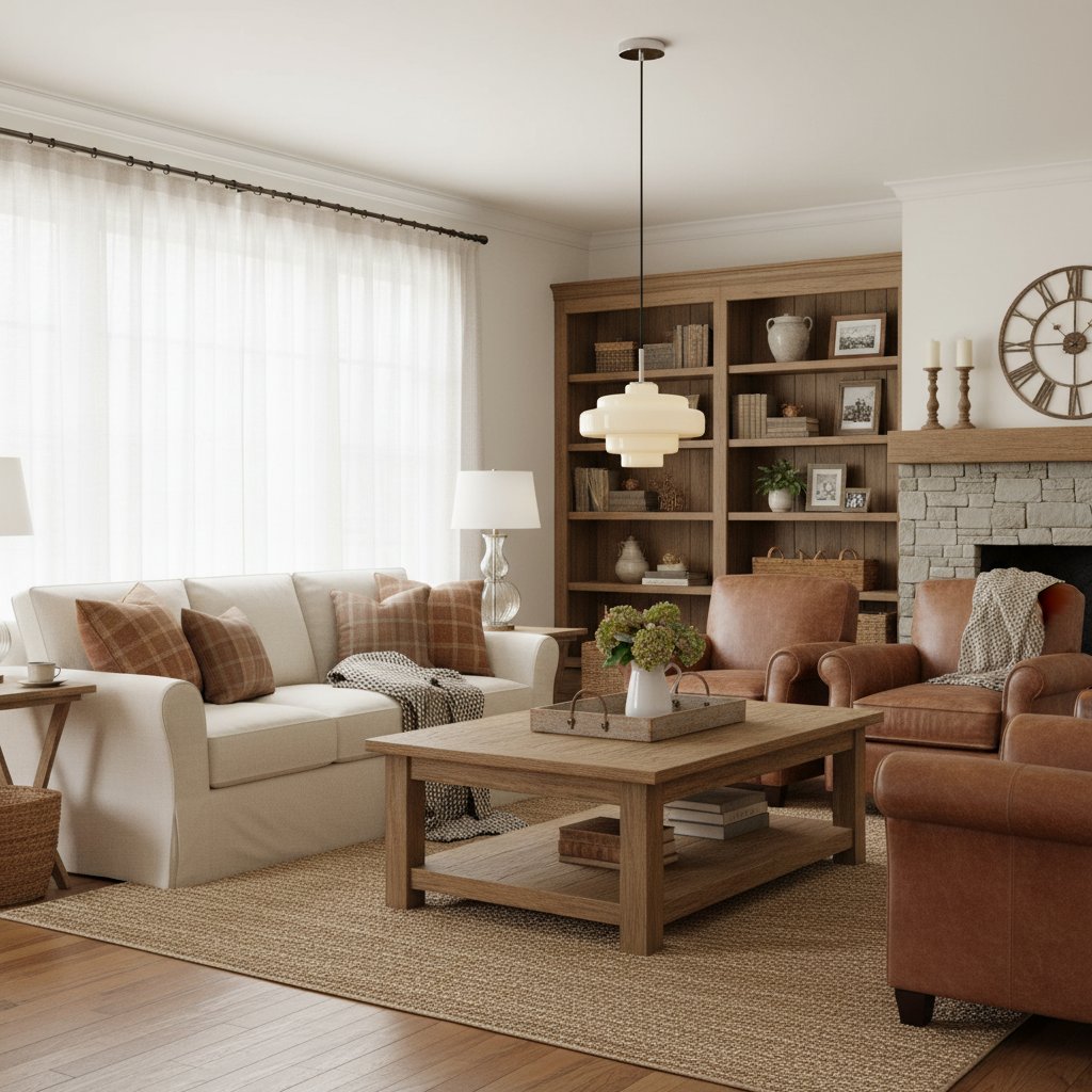
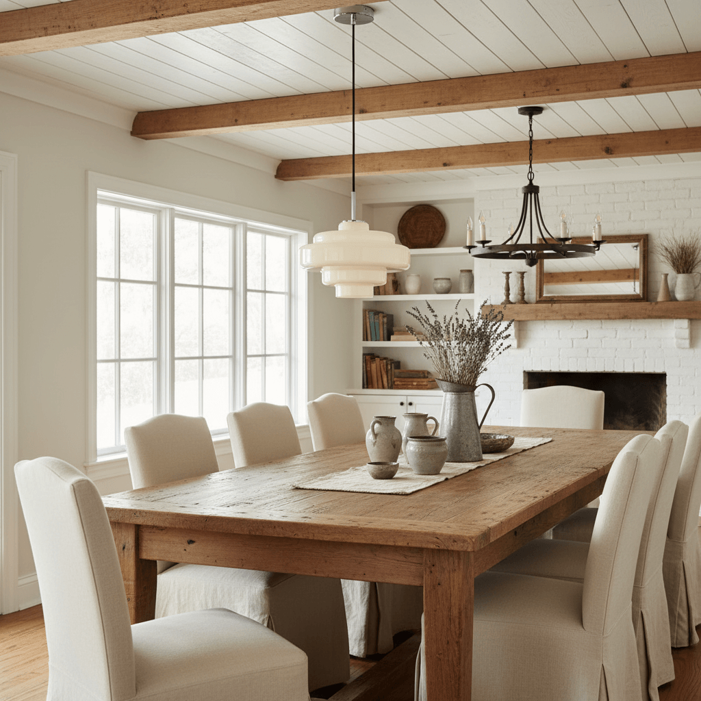
Amber is a natural fit for rooms built around oak, walnut, cream, terracotta or aged-looking finishes. It adds colour without demanding that every other object acknowledge it. This makes it useful above a breakfast table, in a cosy dining corner or in a living-dining space where the pendant must share attention with books, artwork and furniture.
Do not assume every warm finish belongs together. Beside honey-toned wood and beige walls, amber needs a pale stone surface, cooler paint, black cord or chrome to keep a clear outline.
See the Koloro colour options in the same 30 cm shape
Smoke Grey: Calm, Graphic and More Dependent on Its Background
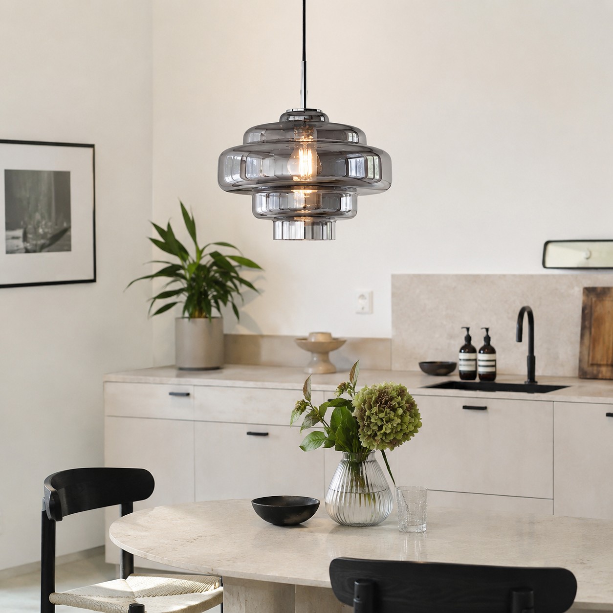
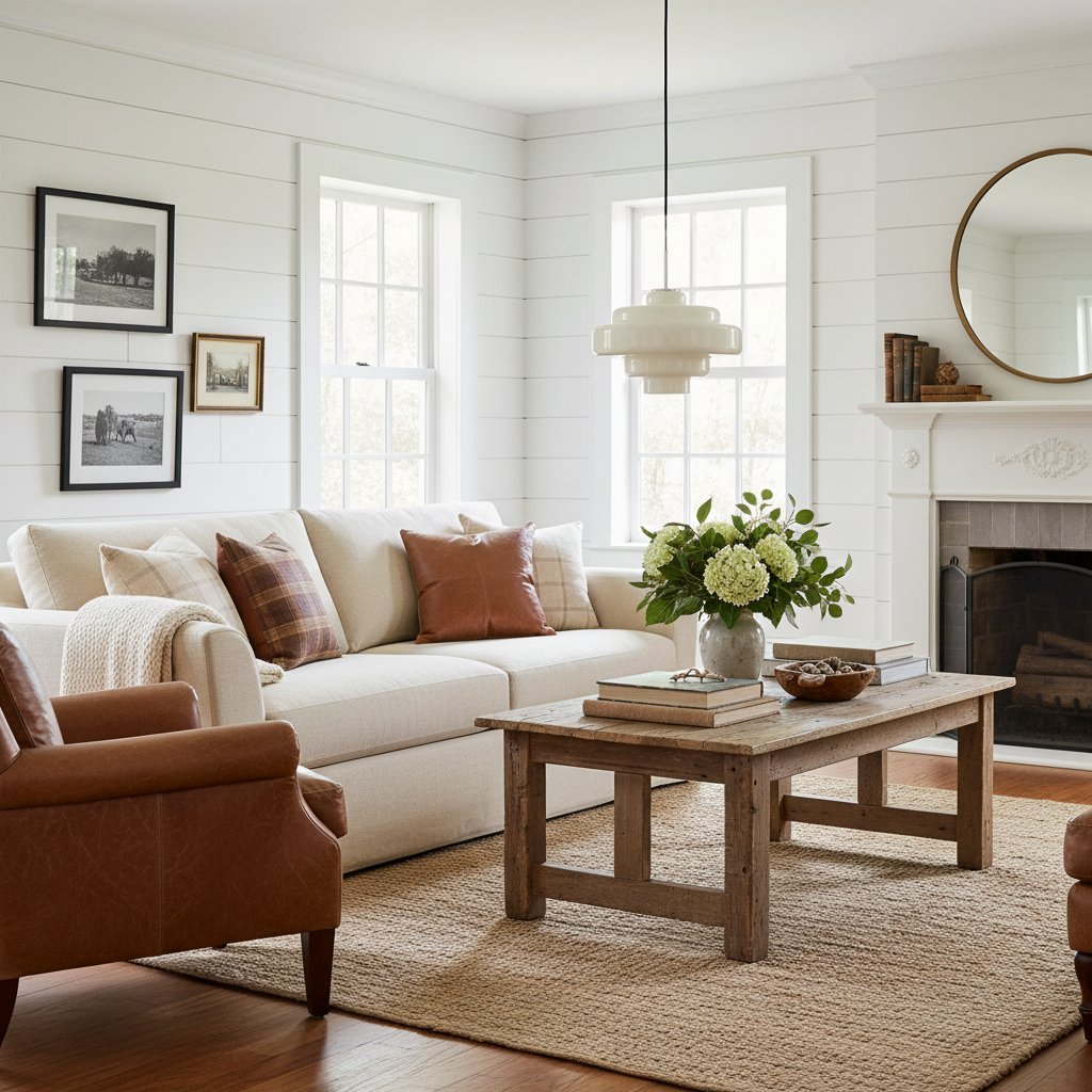
Smoke grey suits rooms with pale stone, white walls, black accents, chrome or cooler timber. It can make a rounded pendant feel more architectural and less nostalgic, which is useful if you like the Koloro shape but do not want the room to lean heavily into a 1970s mood. On a bright background, the tint gives the glass a clean outline without the visual weight of an opaque black shade.
It is also the colour most likely to be misjudged from a close product photograph. In a dim corner or against charcoal cabinets, the shade may read darker than expected. That does not make it wrong; it means the surrounding contrast matters more. Test the ceiling position from the doorway and seated eye level, not only from directly beneath the fitting.
Let Furniture and Finishes Break the Tie
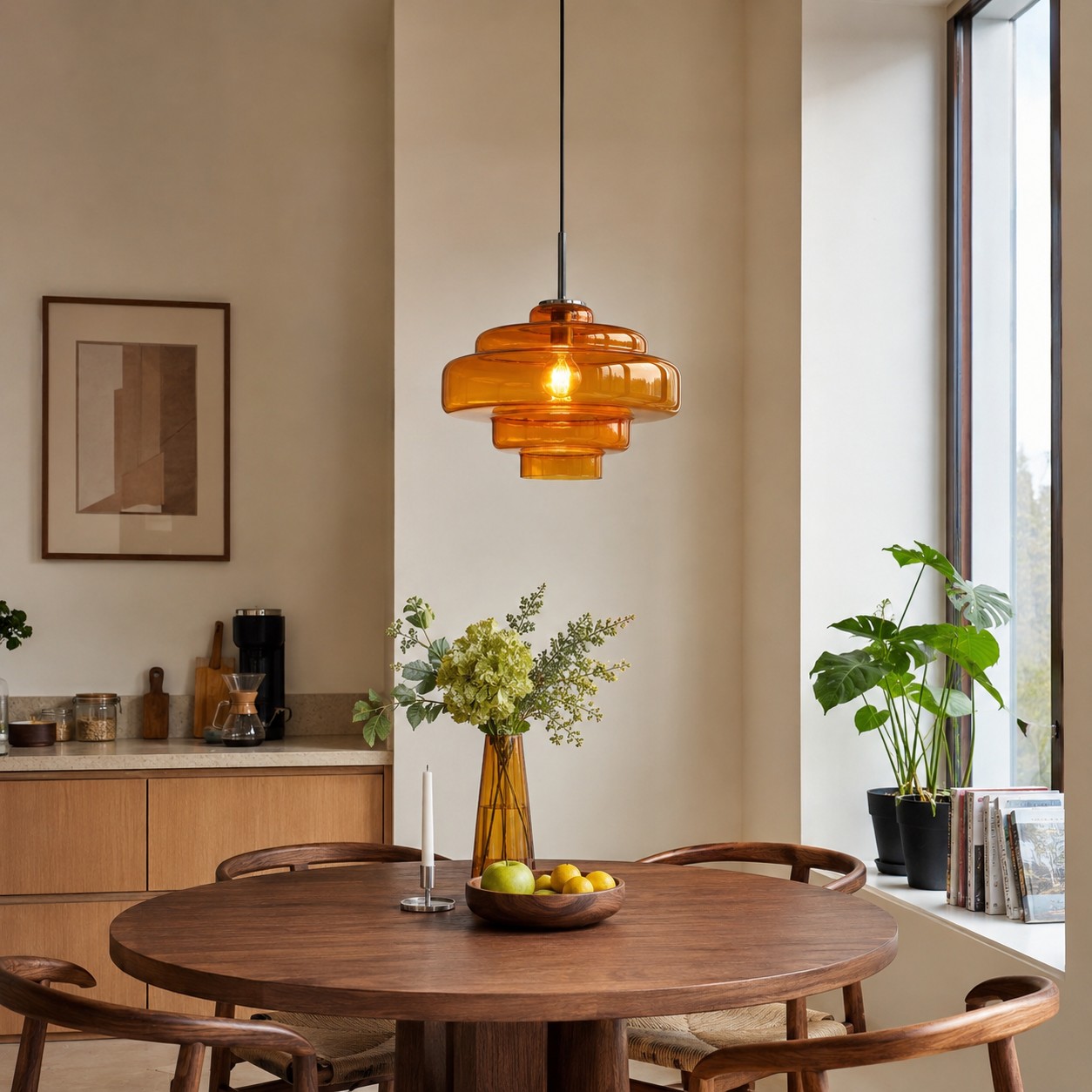
If two colours still work, stop comparing the glass and compare the room's permanent materials. Orange can pull warmth from a single rust-coloured artwork without matching it exactly. Amber can bridge cream stone and walnut. Smoke grey can connect chrome, black handles and a pale mineral worktop. The aim is a relationship, not an exact colour sample.
For a more detailed material-by-material method, How to Match Glass Pendant Lights with Furniture and Finishes takes the decision beyond wall colour and considers timber, stone, hardware and furniture shape. That is the useful next step when your shortlist looks equally good against the paint but behaves differently beside the table or worktop.
Pay attention to reflected highlights as well. The Canadian Centre for Occupational Health and Safety explains that glare can come from bright sources or reflections and recommends checking from the normal viewing position. Its lighting ergonomics guidance is written for workplaces, but the viewing habit translates neatly to a glossy dining table: sit down, look across the surface and make sure the pendant is comfortable in the real line of sight.
Renters Still Need to Judge the Ceiling Point
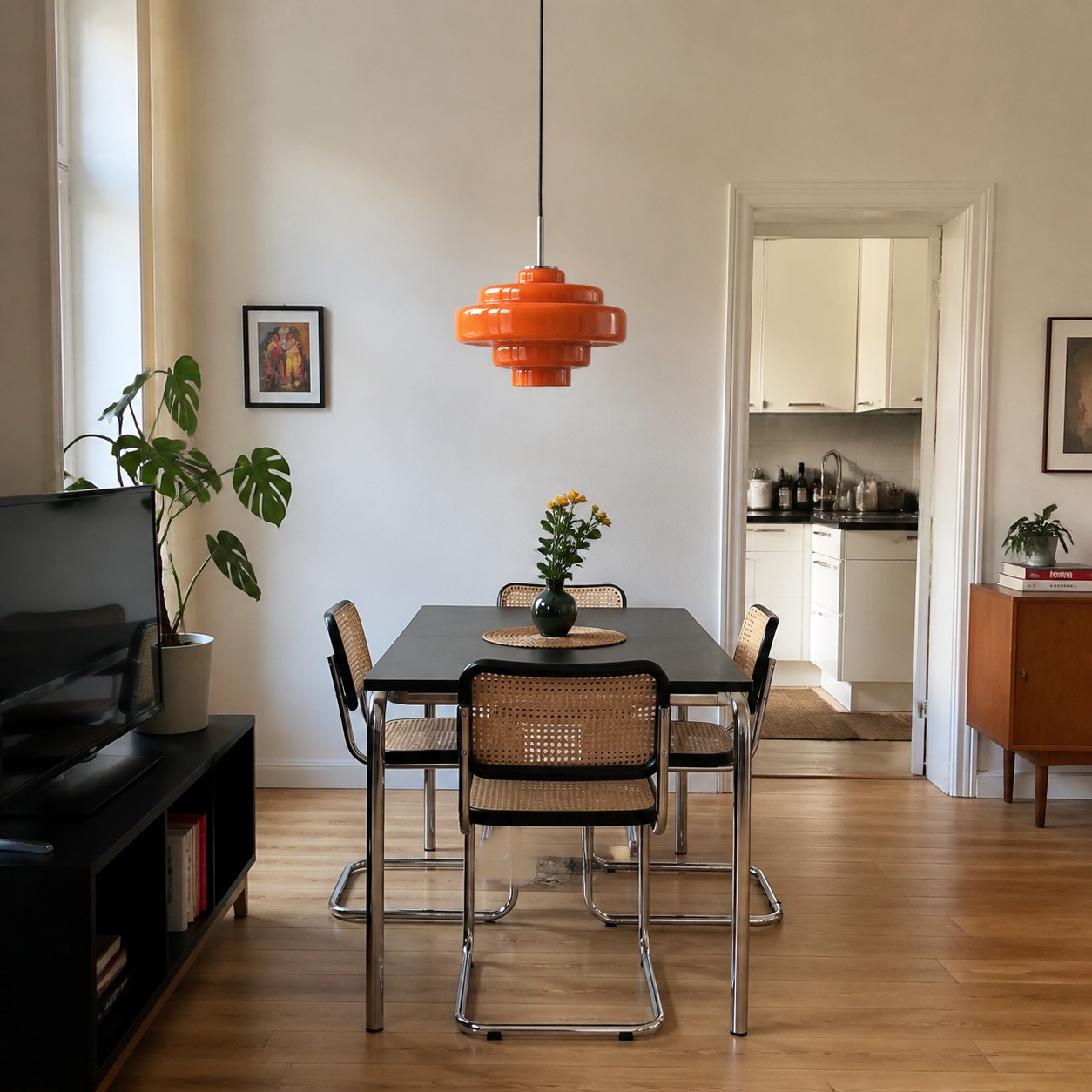
In a rental, the fixed wiring point may sit where the builder found it convenient rather than where your table naturally belongs. Colour cannot rescue an awkward position. Before ordering, mark the 30 cm diameter with paper or tape, view it from the entrance and confirm that the drop will work with your furniture and circulation. The Koloro is hardwired and has an adjustable hanging height, so the installation point and final drop should be agreed before fitting.
Pendant Lighting Ideas for Rental Flats That Still Feel Personal explores how a pendant can define a dining zone without relying on permanent decorative changes. Here, the same principle helps with colour: let the glass become the intentional feature, then keep portable accessories flexible enough to move with you.
The Shade Colour and the Bulb Are Two Separate Decisions
A warm-looking shade does not remove the need to choose a suitable bulb. Colour temperature describes the colour appearance of the light itself and is expressed in kelvins; the overview of colour temperature is a useful primer if the numbers on bulb packaging are unfamiliar. Treat that specification separately from the orange, amber or smoke tint of the glass.
Judge the pendant twice. Unlit, it must work with daylight, paint and furniture. Lit, it becomes part of the evening atmosphere and should feel comfortable at the table.
A Five-Minute Decision Before You Buy
- Choose orange when a quiet room needs a focal point and the immediate background gives it breathing space.
- Choose amber when you want warmth to sit naturally with timber, cream and earthy finishes, while retaining one cooler or darker counterpoint.
- Choose smoke grey when the room is pale, mineral or graphic and you can give the tinted glass enough background contrast.
- Check all three ideas from the doorway, a seated position and the adjoining room.
- Confirm the ceiling point, 30 cm scale, hanging height and hardwired installation before colour becomes the only conversation.
Once one option survives those checks, stop searching for a universally correct answer. The right glass colour is the one that improves your room in both daylight and evening use. Review the Koloro Millie Glass Pendant Light with your three fixed materials and real sightlines in mind.
Questions People Ask About Coloured Glass Pendants
How do I choose pendant lights with glass shades?
Start with scale and position, then choose the tint against the largest fixed surfaces. Check the fitting unlit in daylight and lit from the places where you will actually see it.
Why are glass pendant lights so popular?
Glass gives a pendant visual presence without the solid block of an opaque shade. Coloured glass also lets one fitting act as a controlled accent in an otherwise simple room.
Is amber or smoke grey better for a small dining area?
Neither is automatically better. Amber tends to sit easily with warm timber; smoke grey can look crisp against a pale wall. Background contrast and the view from the seats matter more than room size alone.
Does an orange pendant need other orange accessories?
No. One small echo can help, but repeating orange around the room may weaken the pendant's role as the focal point. Neutral materials often make the colour look more deliberate.
Should I choose the bulb before the glass colour?
Choose them together but assess them separately. The shade must work as an unlit object, while the bulb's colour appearance and brightness must suit the activity and evening atmosphere.